Crafting Consistent, Vivid Colors for Today's On-the-Go Screens
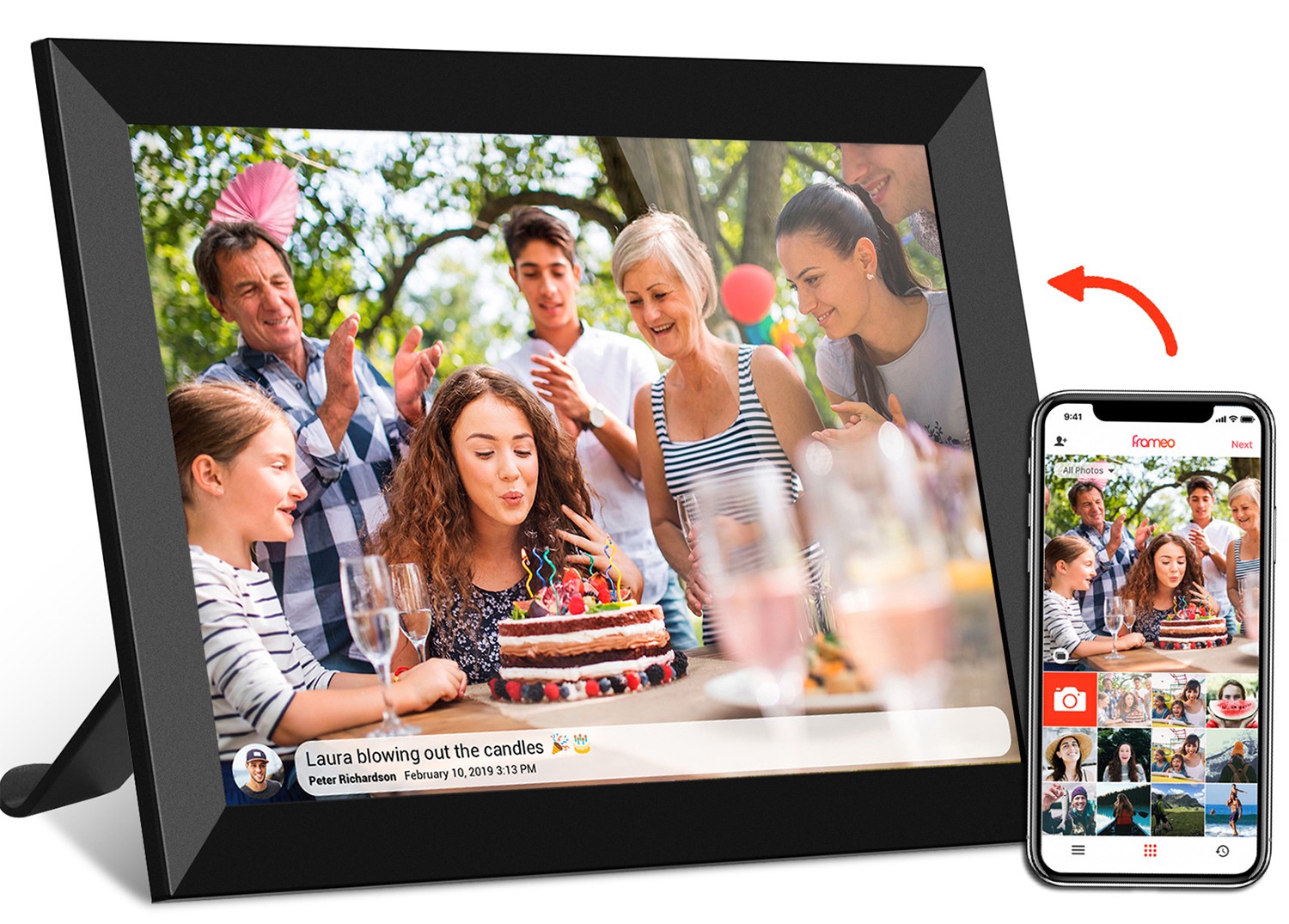
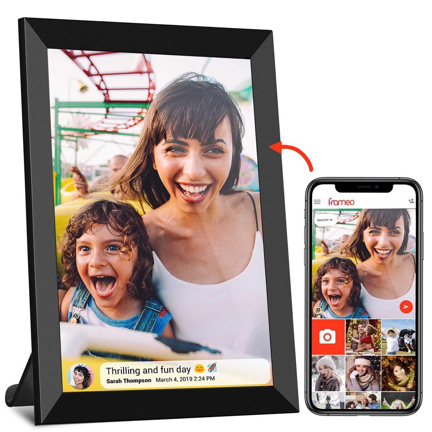
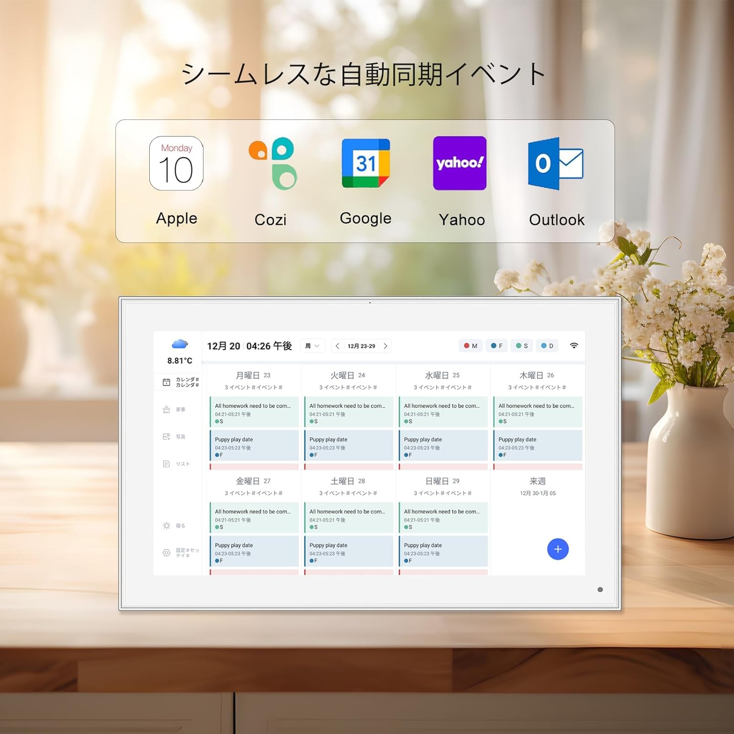
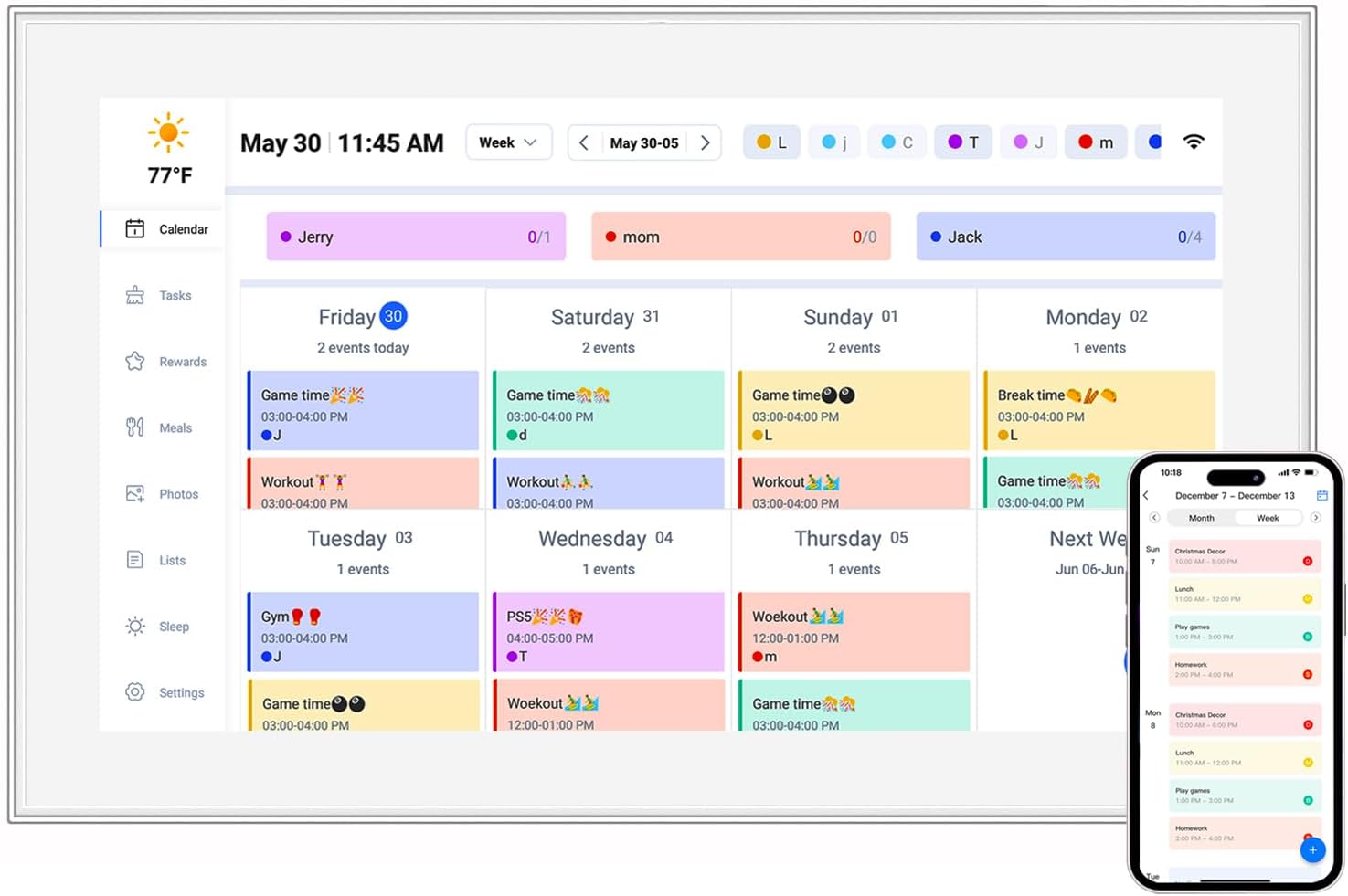
Walk into any home, office, or even a café, and you'll likely spot a handful of portable displays quietly enhancing daily life: a digital photo frame on the mantel showcasing family memories, a 24.5 inch portable monitor propped up on a coworker's desk, or a 10.1 inch digital calendar by the kitchen sink keeping track of appointments. These devices aren't just tech—they're storytellers, helpers, and companions. But here's the thing: their impact hinges entirely on one often-overlooked element: color.
Imagine (oops, scratch that—think about) flipping through photos on a digital photo frame only to find your child's birthday cake looks neon pink instead of soft rose, or staring at a portable monitor where the graphs in your presentation appear washed out, making your data harder to parse. Even a digital calendar can feel off if the date numbers are a muddy gray instead of the crisp black you expected. Color management is the invisible hand that prevents these letdowns, ensuring the colors you see on these devices match the ones intended by designers and photographers. It's not just about pixels and code; it's about making sure these screens feel right —like they're reflecting the real world, or at least the world we want to see.
In this article, we'll dive into the art and science of color management for portable display printing processes. We'll break down why it matters, the challenges manufacturers and designers face, and the strategies that turn inconsistent hues into reliable, vibrant experiences. Whether you're a producer of incell portable smart tv units or a designer creating content for digital photo frames, understanding these principles will help you build devices that don't just display colors—they deliver them.
Before we talk about managing colors, let's make sure we're speaking the same language. Colors on screens are created using light, which is different from how colors are printed on paper (using inks). Most portable displays—from your 24.5 inch portable monitor to a tiny digital calendar—rely on the RGB color model: red, green, and blue light combined in varying intensities to produce millions of shades. Think of it like mixing paint, but with light: red + green = yellow, blue + green = cyan, and so on. The more intense each color, the brighter the result; when all three are maxed out, you get white.
But here's where it gets tricky: not all RGB is created equal. A digital photo frame might use an LCD panel with a limited range of reds, while a high-end portable monitor could boast an OLED screen with deeper, more saturated greens. This range is called the "color gamut," and it's measured using standards like sRGB, Adobe RGB, or DCI-P3. For example, sRGB is the most common gamut for everyday devices—it's what your laptop, phone, and likely your digital photo frame use. Adobe RGB and DCI-P3 are wider, meaning they can display more colors, which is why they're popular in professional monitors and some premium portable displays.
Why does this matter for color management? If a designer creates an image using the Adobe RGB gamut but the digital calendar it's displayed on only supports sRGB, the colors will look dull or distorted. The calendar can't "see" the extra colors in Adobe RGB, so it crushes them into its smaller gamut, resulting in lost detail. It's like trying to fit a square peg into a round hole—something's gotta give, and it's usually the quality of the image.
| Device Type | Common Color Gamut | Typical Use Case | Color Depth |
|---|---|---|---|
| 24.5 inch Portable Monitor | sRGB (99%+) or DCI-P3 (for pro models) | Productivity, photo editing, gaming | 8-bit (16.7M colors) or 10-bit (1.07B colors) |
| 10.1 inch Digital Photo Frame | sRGB (70-90%) | Displaying family photos, artwork | 8-bit (16.7M colors) |
| 10.1 inch Digital Calendar | sRGB (60-80%) | Daily schedule, reminders, weather | 8-bit (16.7M colors) |
| Incell Portable Smart TV | DCI-P3 (for mid-to-high end) | Streaming movies, sports | 10-bit (1.07B colors) |
Another key term is "color depth," measured in bits. An 8-bit display can show 16.7 million colors, while 10-bit bumps that up to over a billion. For most portable devices like digital calendars or basic digital photo frames, 8-bit is enough—you won't notice the difference in everyday use. But for a portable monitor used by a graphic designer, 10-bit is non-negotiable; it prevents "banding," those ugly stripes that appear when colors transition too abruptly.
If color models are the language, then the challenges of color management are the accents and dialects that make communication messy. Even with RGB as the foundation, getting colors to look the same across devices—or even across the same model of device—is surprisingly tough. Let's unpack the biggest culprits.
Not all screens are built the same. A digital photo frame might use a TN (Twisted Nematic) panel, which is cheap but has poor color accuracy and viewing angles—tilt the frame slightly, and the photo of your dog suddenly looks like it's in a sepia filter. A 24.5 inch portable monitor, on the other hand, might opt for an IPS (In-Plane Switching) panel, which offers better color consistency from different angles but can be more expensive. Then there's OLED, which delivers deep blacks and vibrant colors but can suffer from "burn-in" if static images (like a digital calendar's date display) are left up too long.
Even within the same technology, manufacturing differences play a role. Two 10.1 inch digital calendars rolling off the same production line might have slightly different backlight brightness or color filters, leading to one appearing warmer (more yellow) and the other cooler (more blue). For users, this is confusing: if they buy two calendars for their home and office, why do the same event colors look different?
Colors don't exist in a vacuum—they're affected by the light around them. A digital photo frame in a sunlit living room will reflect light off its screen, washing out colors, while the same frame in a dim bedroom might make those colors look oversaturated. This is why some high-end portable displays, like certain incell portable smart TVs, include ambient light sensors that adjust brightness and color temperature in real time. But for budget devices, this feature is often skipped, leaving users to manually tweak settings—a hassle most people won't bother with.
Even if the display is perfect, the content being shown might be the problem. A designer creating images for a digital calendar might work on a high-end monitor with a wide color gamut, forgetting that the calendar's screen has a narrower range. When the calendar displays the image, the bright red "deadline" reminder might turn into a muddy brown. Or a user uploading photos to their digital photo frame might compress the images too much, losing color data and making family portraits look flat.
Screens degrade over time. The backlight in a portable monitor might dim after a few years, making whites look gray. The color filters in a digital photo frame could shift, turning all images a subtle green. For devices meant to last—like a digital calendar that sits on a desk for a decade—this is a big issue. Users don't expect to replace these gadgets every year, so color management needs to account for longevity, ensuring colors stay consistent even as components age.
So, how do we tackle these challenges? A strong color management strategy isn't a one-time fix—it's a process that spans design, production, and post-launch support. Let's break down the key components.
Before a single pixel is designed or a screen is manufactured, you need to know what "good" looks like for your device. For a 10.1 inch digital photo frame, the priority might be accurate skin tones and natural-looking landscapes, so you'd target a color gamut close to sRGB (since most consumer photos are in sRGB). For a 24.5 inch portable monitor aimed at professionals, you might aim for 100% sRGB coverage and 90% DCI-P3 to handle both work and media consumption.
Document these targets in a "color specification sheet" that includes: color gamut, white point (the temperature of white, measured in Kelvin—6500K is standard for most displays), gamma (how the screen responds to brightness levels), and color depth. Share this sheet with designers, engineers, and manufacturers so everyone's aligned.
Manufacturing is where color consistency is made or broken. Each device should be calibrated before leaving the factory to ensure it meets the target profile. This involves using tools like colorimeters (devices that measure color accuracy) and spectrophotometers (which analyze light wavelengths) to adjust settings like brightness, contrast, and color balance.
For example, a factory producing 10.1 inch digital calendars might use an automated calibration station: each calendar is powered on, a colorimeter is placed against the screen, and software adjusts the RGB gains until the white point hits 6500K and the grayscale (shades of gray from black to white) is smooth. This ensures that even if two calendars have slightly different panels, they'll look nearly identical to the user.
For high-volume production, this calibration needs to be efficient. Some manufacturers use "binning," where screens are sorted into groups based on their color performance, and then calibrated to a common profile. This reduces waste and ensures consistency without slowing down the assembly line.
Designers and content creators play a huge role in color management. If your device is a digital photo frame, provide guidelines for users uploading images: recommend file formats (like JPEG with minimal compression), color spaces (sRGB), and resolution. For pre-loaded content—like the default backgrounds on a portable monitor or the icons on a digital calendar—design with the device's color profile in mind.
Consider including a "color preview" tool in your companion app. For example, a user designing a custom calendar background could upload their image and see a simulation of how it will look on the actual 10.1 inch digital calendar screen. This prevents disappointment and reduces the number of "my colors look wrong" support tickets.
Even with factory calibration, users might want to tweak colors to their liking. Maybe they prefer warmer tones in their digital photo frame, or their office lighting makes the portable monitor look too cool. Include simple calibration tools in the device settings: a "color temperature" slider (warm to cool), a "saturation" control, and maybe a "reset to factory defaults" option for when things get too messed up.
Avoid overwhelming users with technical options like "gamma adjustment" or "RGB gain." Keep it simple, and provide presets: "Vivid" for photos, "Natural" for everyday use, "Reading" for text-heavy content (like a digital calendar). Presets guide users toward better results without requiring them to become color experts.
Color management doesn't end when the device ships. Collect feedback from users about color issues—are multiple people complaining that the digital photo frame's reds are too bright? Maybe a batch of screens has a manufacturing defect. Use this feedback to adjust future production runs or release a firmware update that tweaks the color profile.
For devices with long lifespans, like incell portable smart TVs or commercial digital signage, consider offering professional calibration services. A restaurant using digital menu boards might pay to have their screens calibrated annually to ensure food photos look fresh and appetizing. This not only improves the user experience but also creates an additional revenue stream.
Let's put this all into context with a real-world example. A mid-sized electronics company, let's call them "CalendaTech," was struggling with customer complaints about their 10.1 inch digital calendar. Users reported that event colors varied widely between units—one calendar's "birthday" pink was another's "meeting" purple—and that text sometimes looked washed out in bright rooms. Sales were stagnating, and returns were up. Here's how they turned it around with a color management strategy.
CalendaTech started by testing 50 random units from their latest production run. Using a colorimeter, they found that: 1) White point varied from 5800K (warm) to 7200K (cool), way outside the target 6500K; 2) Color gamut coverage was only 65% sRGB, below their advertised 80%; and 3) Backlight brightness was inconsistent, leading to washed-out text in bright light.
They adjusted their color specification sheet to realistic targets: 75% sRGB coverage, 6500K white point (±200K), and a minimum brightness of 300 nits (to combat ambient light). They switched panel suppliers to one that specialized in small-format, color-accurate screens, paying a slight premium but reducing variability.
CalendaTech added an automated calibration station to their production line. Each calendar now runs through a 5-minute calibration process: the screen displays a series of color patches, the colorimeter measures them, and software adjusts the RGB gains and backlight to hit the targets. Units that can't meet the specs are rejected (reducing waste long-term by catching issues early).
They updated the calendar's firmware to include three presets: "Day Mode" (brighter, cooler for sunlight), "Night Mode" (dimmer, warmer for bedrooms), and "Auto" (uses the built-in light sensor to switch modes). They also added a "color temperature" slider with only three positions: Warm, Natural, Cool. No more technical jargon—just simple choices.
CalendaTech revised their user manual to include tips for choosing event colors (e.g., "Avoid light pastels for important events; they may be hard to see in bright rooms") and updated their companion app to include a color preview tool. They also pre-loaded the calendar with higher-quality, sRGB-optimized background images.
Within three months, customer complaints dropped by 70%. Returns fell by 45%, and sales increased by 20% as word spread that the new CalendaTech calendars had "consistent, vibrant colors." A follow-up test of 50 new units showed white point variance within 150K, color gamut at 78% sRGB, and brightness consistent at 320 nits. The investment in color management paid off—not just in happier customers, but in a stronger brand reputation.
At the end of the day, color management isn't just about numbers on a spec sheet. It's about making portable displays feel intentional and reliable. When a grandmother looks at her digital photo frame and sees her grandchild's smile in the same warm tones as the day the photo was taken, that's color management working. When a remote worker's 24.5 inch portable monitor displays their presentation with the exact shade of brand blue they chose, that's trust built through consistency. When a busy parent glances at their 10.1 inch digital calendar and can instantly tell a "deadline" red from a "reminder" orange, that's efficiency enabled by good color design.
For manufacturers, investing in color management is an investment in user satisfaction and loyalty. It differentiates your products in a crowded market—after all, anyone can make a portable display, but not everyone can make one that always looks "right." For designers and content creators, understanding color management ensures your work is seen as intended, whether it's on a tiny digital calendar or a large incell portable smart TV.
So, the next time you power on your portable monitor, adjust your digital photo frame, or check your digital calendar, take a moment to appreciate the colors. Behind every vibrant image and clear text is a strategy that turned light and code into something meaningful: a connection to the moments, tasks, and memories that matter.