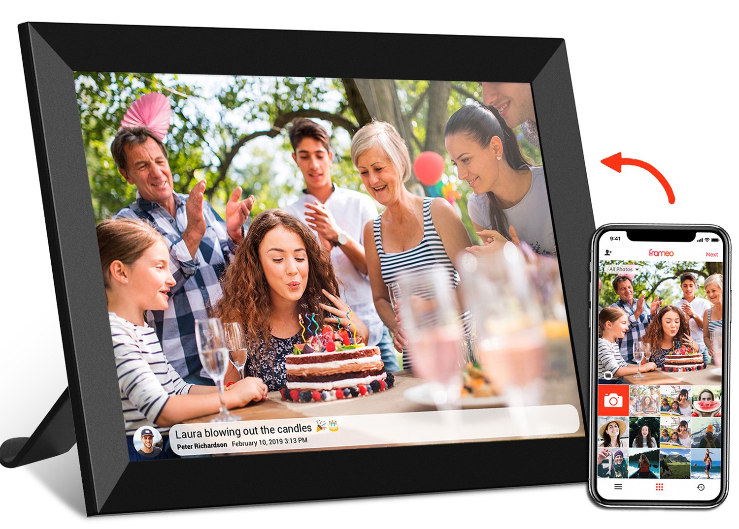
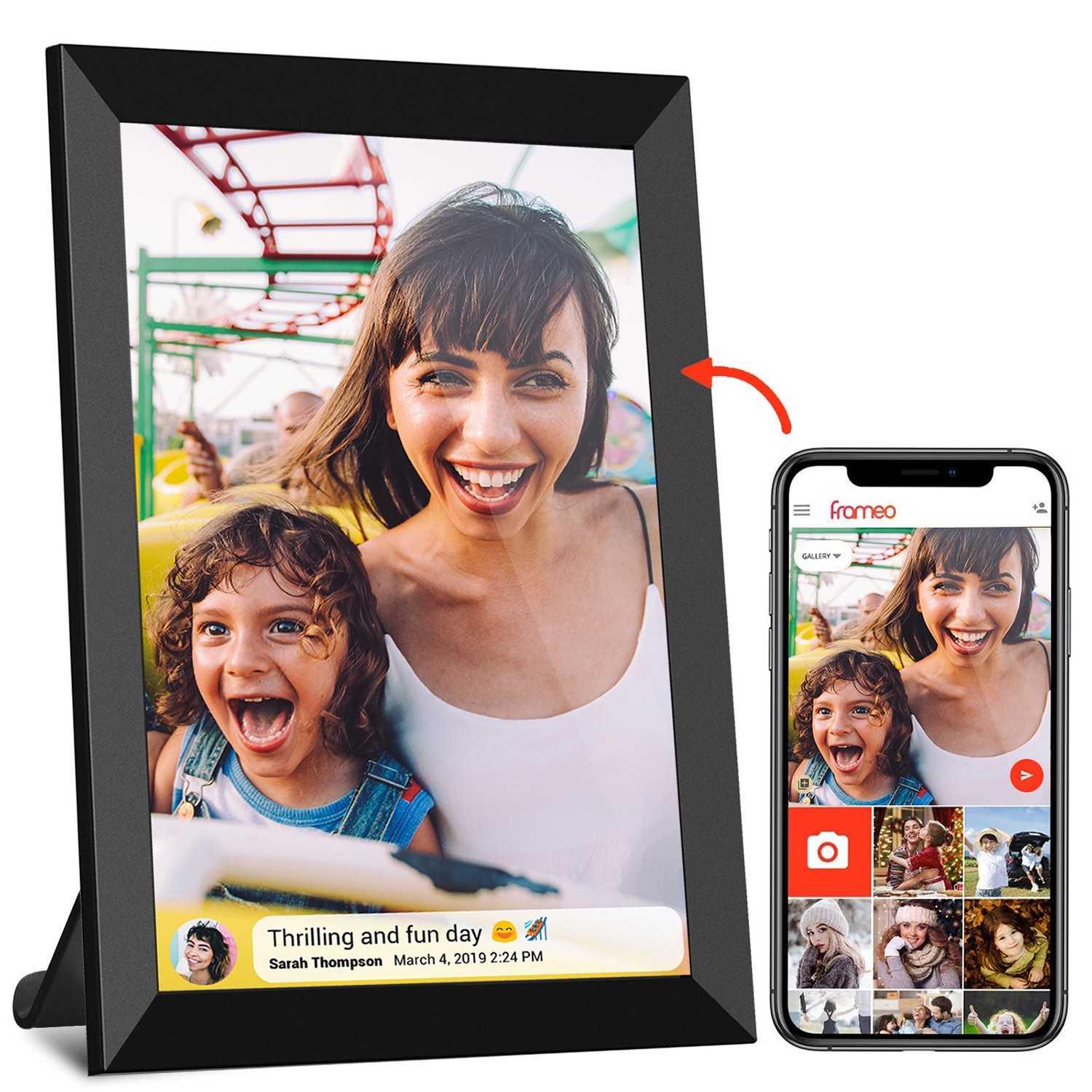
Digital signage isn't just a screen—it's a conversation starter, a information hub, and sometimes even a lifeline for connecting with your audience. But if you're updating content without a clear plan, you might as well be shouting into the void. Let's walk through the key factors that turn a random content refresh into a strategic, audience-pleasing success.
Before you even open your content management tool, pause and ask: Who is going to see this? Digital signage lives in diverse spaces—hospitals, offices, retail stores, lobbies—and each audience has unique needs. Let's break it down with real-world examples.
Suppose you're managing a busy hospital lobby. Here, your audience includes anxious patients, tired caregivers, and time-pressed staff. A healthcare android tablet mounted near the reception desk needs content that's calm, clear, and actionable. Think large fonts for easy readability (no squinting!), soft colors to reduce stress, and quick updates like wait times or doctor availability. Flashy animations or jargon? They'll only add to the chaos.
Now, flip to a corporate office with meeting room digital signage . Here, the audience is professionals rushing between meetings. They need bite-sized info: room bookings, Wi-Fi codes, or last-minute agenda changes. Long paragraphs won't work—they'll glance at the screen for 2 seconds and keep moving. Prioritize bullet points, bold headings, and high contrast to make key details pop.
Even within the same space, audiences vary. A floor standing digital signage in a mall might target teens during the day (trendy product ads, social media challenges) and families in the evening (dinner specials, kid-friendly store highlights). The bottom line? If you don't tailor content to who's watching, you're not communicating—you're just taking up screen space.
Updating content because "it's been a month" is like rearranging furniture for no reason—pointless. Every refresh should tie back to a clear goal. Are you trying to boost sales? Inform? Engage? Train staff? Let's map goals to content types.
If your goal is to drive promotions (say, a retail store pushing a weekend sale), your floor standing digital signage near the entrance should lead with high-energy visuals: short video clips of products, countdown timers ("2 days left!"), and clear CTAs like "Scan here for 10% off." The content needs urgency and excitement to stop foot traffic in its tracks.
For internal communication—like in a corporate office— meeting room digital signage might focus on alignment. Maybe your team is rolling out a new company policy. Instead of a boring memo, display a 30-second animated explainer on the meeting room screen. Add a QR code linking to a full FAQ doc for anyone who wants details. Now you're not just informing—you're making compliance easy.
Even educational goals need focus. A university campus using digital signage to guide new students should prioritize wayfinding (campus maps, building hours) over event ads during orientation week. Save the concert flyers for mid-semester when students are settled. Goals keep content intentional, not random.
Ever spent hours designing a beautiful slideshow, only to see it pixelated or cut off on the screen? Technical missteps are the silent killers of great digital signage. Let's dive into the specs that matter.
First, resolution and aspect ratio. A 21.5-inch wifi digital photo frame (common in lobbies) has a different aspect ratio than a 15.6-inch digital calendar (think office desks). If you design for 16:9 but your screen is 4:3, your content will stretch or get cropped—ruining all that hard work. Check your device specs first! Most manufacturers list this info in the user manual or online (look for terms like "1920x1080" for resolution or "16:9 widescreen").
Then there's software compatibility. POE meeting room digital signage (Power over Ethernet) is a game-changer for easy updates—you can push new content via the network without physical access. But if your content uses a file format the software doesn't support (looking at you, obscure video codecs!), it'll either fail to play or lag. Stick to basics: MP4 for videos, JPG/PNG for images, and PDF for text-heavy content. When in doubt, test on one screen before rolling out company-wide.
Don't forget about connectivity. A remote office with spotty Wi-Fi might struggle with large video files, leading to buffering. For these cases, opt for static images or shorter clips. Conversely, a healthcare android tablet in a clinic with strong POE connections can handle live updates (like real-time patient wait times) without a hitch. Match content size and complexity to your network's strength.
| Signage Type | Ideal Content Formats | Key Technical Checks |
|---|---|---|
| Floor Standing Digital Signage | Videos (15-30 sec), high-res images | 16:9 aspect ratio, 1080p+ resolution, bright screen for ambient light |
| Meeting Room Digital Signage (POE) | PDFs, short animations, live text updates | Software compatibility (e.g., Microsoft Teams integration), low latency |
| Healthcare Android Tablet | Static images, clear text, calm videos | Anti-glare screen, easy-to-read fonts (min 14pt), HIPAA-compliant software |
A screen in a sunlit lobby needs different content than one in a dimly lit hospital corridor. Environmental context shapes how your content is perceived—and whether it's even noticed. Let's break down the key variables.
Lighting is first. A floor standing digital signage near a window will wash out if you use light-colored text on a white background. Opt for dark backgrounds with bold, bright text (think black or navy with yellow or white fonts) to combat glare. Conversely, a meeting room with soft overhead lights can handle more subtle colors—pastels or muted tones won't strain eyes during long meetings.
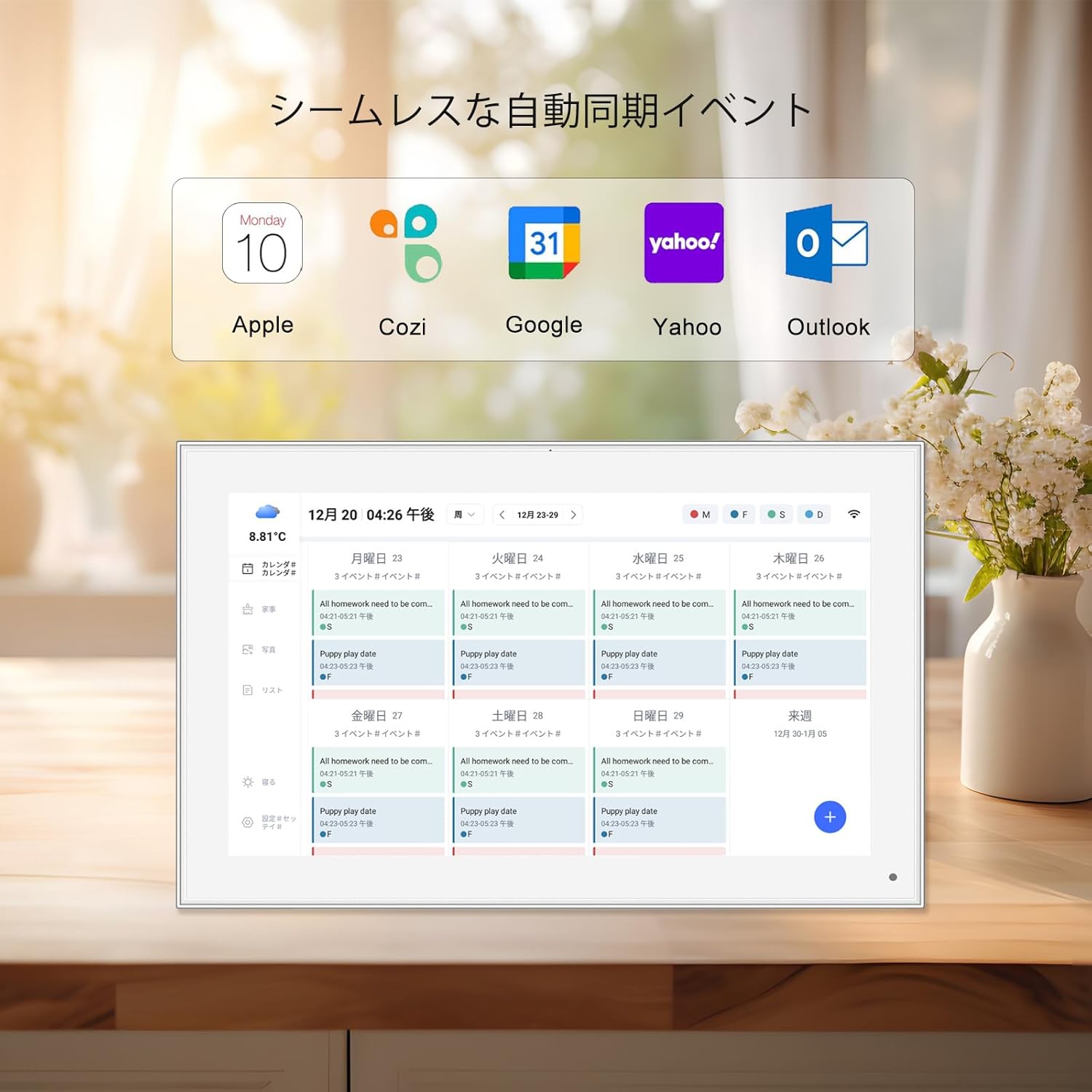
Viewing distance is next. A 10.1-inch digital calendar on a reception desk is meant to be read up close, so you can include details like daily schedules or weather. But a 43-inch digital signage above a store entrance? People will see it from 20+ feet away—stick to large visuals, minimal text, and big logos. If you're not sure, stand where your audience stands and ask: "Can I read this in 3 seconds?" If no, simplify.
Foot traffic speed matters too. In a busy airport, viewers have 2-3 seconds to absorb your message—so content must be ultra-simple (e.g., "Gate 5B: Chicago, 15 min"). In a waiting room, where people linger, you can use longer videos or rotating slides (but keep each slide under 10 seconds to avoid boredom). A healthcare android tablet in a patient room might even include interactive elements (like "Swipe for today's menu") since viewers have time to engage.
There's a sweet spot between "stale content that no one notices" and "constant updates that confuse viewers." How do you find it? It depends on your audience and content type.
Time-sensitive content (promotions, event info, weather) needs frequent updates. A café using floor standing digital signage to display daily specials should refresh content every morning. A meeting room digital signage with room bookings? update in real-time—nothing frustrates a team more than showing a "free" room that's actually occupied.
Evergreen content (brand messaging, safety tips, company values) can stay longer—2-4 weeks. But even then, mix it up! If you're displaying a "Welcome to Our Office" slide, swap the background image monthly or add a seasonal twist (snowflakes in December, flowers in spring). Repetition breeds familiarity, but too much repetition breeds apathy.
Beware of "update overload." If your screen changes every 10 seconds, viewers will tune out. Aim for a rotation that gives each piece enough time to register: 5-10 seconds for simple images, 15-30 seconds for short videos. And don't stack too many messages—3-5 pieces of content per rotation is ideal. Quality over quantity always wins.
Your digital signage is an extension of your brand—so if your website uses blue and gold, your social media is playful, and your signage is neon pink with formal text, something's off. Inconsistency confuses viewers and weakens trust. Here's how to keep it cohesive.
Start with colors and fonts. Use your brand's official color palette (you can find this in your style guide or ask marketing). If your logo is navy and orange, those should be the dominant colors on screen. For fonts, stick to 1-2 per screen (e.g., Arial for headings, Calibri for body text) to avoid clutter. A healthcare android tablet might use a clean, sans-serif font like Roboto for readability, while a retail store could get creative with a bold display font—just don't mix 5 different ones!
Tone matters too. A kids' store's floor standing digital signage can be energetic and playful (emojis, slang, bright animations). A law firm's meeting room signage? Professional, concise, and formal. If your brand voice is "friendly expert," your content should sound like a knowledgeable friend—not a robot or a salesperson.
Don't forget about logos and spacing. Your logo should appear in the same spot (top left, for example) on every slide, and there should be "breathing room" around text and images (no cramming content to the edges!). Consistency doesn't mean boring—you can still get creative within your brand's guidelines. It just means viewers will instantly recognize "this is us " when they see your screen.
You've updated the content—now what? If you don't track results, you'll never know if that new promotion actually boosted sales or if that meeting room info reduced confusion. Measurement turns guesswork into strategy.
Start with simple metrics. For customer-facing signage (like floor standing digital signage ), track foot traffic near the screen vs. sales of promoted products. Did foot traffic increase when you displayed a new ad? Did sales of that product go up? For internal signage, survey staff: "Did the meeting room updates make booking easier?" or "How often do you check the digital calendar?"
Advanced tools can help too. Some digital signage software (especially POE meeting room digital signage systems) track "dwell time" (how long people look at the screen) or touch interactions (if it's a touchscreen). If dwell time is 2 seconds for a new video, maybe it's too confusing—simplify it. If a "Scan for details" QR code gets zero scans, the CTA might be too small or unclear.
The key is to iterate. If a slide about "Staff Appreciation Week" gets rave reviews, keep that tone for future internal content. If a product ad flops, try a different angle (better visuals, shorter text, clearer CTA). Digital signage is a conversation—so listen to what your audience is (or isn't) telling you, and adjust accordingly.
Updating digital signage content isn't a chore—it's a chance to connect with your audience in meaningful ways. By focusing on who you're talking to, what you want to achieve, technical specs, environment, timing, brand, and measurement, you'll turn your screen into a tool that informs, engages, and even delights.
Remember: The best digital signage feels like a natural part of the space, not an afterthought. So next time you hit "update," take a moment to ask: "Is this content worth someone's time?" If the answer is yes, you're on the right track.