In a world where we interact with screens more than ever—whether scrolling through social media, working on a project, or keeping the kids entertained with educational apps—the little details of our devices can make a big difference. One such detail that often flies under the radar? Aspect ratio. You might not think about it when unboxing a new android tablet or setting up a digital signage display, but this simple ratio of width to height shapes everything from how you watch movies to how easy it is for your child to navigate a learning game on their kids tablet. Let's dive into why aspect ratio matters, how it affects different uses, and why choosing the right one can turn a "meh" device into a tool that feels like it was made just for you.
Aspect ratio is the proportional relationship between a screen's width and height, expressed as two numbers separated by a colon (e.g., 16:9). Think of it as the "shape" of the screen. A square-ish screen might have a 4:3 ratio, while a wide, movie-theater-like screen could be 16:9 or even 21:9. It's not about the actual size of the screen—you can have a 10-inch tablet and a 24-inch monitor with the same 16:9 ratio—but rather how that space is distributed.
Back in the days of CRT TVs and early computers, 4:3 was king. It made sense for displaying text and standard-definition content, which was mostly square. But as technology evolved, so did our content. Movies started using wider ratios to capture more of the scene, and suddenly, that 4:3 screen felt cramped. Fast forward to today, and we're spoiled for choice: 16:9, 16:10, 3:2, and even ultra-wide 21:9 ratios are all common, each tailored to different needs. For android tablets, which are jacks-of-all-trades—used for everything from streaming Netflix to video calls to running business apps—getting the aspect ratio right is key to a seamless visual experience.
Before we dive into how aspect ratio impacts your experience, let's get familiar with the most common players in the android tablet and screen world:
Now, let's explore how each of these shapes affects what you see and how you use your device.
Aspect ratio isn't just a number on a spec sheet—it directly impacts how you interact with content. Let's break it down by the most common uses for android tablets, kids tablets, digital signage, and even portable monitors, since many people pair tablets with these for extended setups.
If you're like most people, a big reason you reach for your android tablet is to kick back and watch something. Whether it's a Netflix binge, a YouTube tutorial, or a family video, the aspect ratio of your screen will determine if you're seeing the content as the creators intended—or if you're stuck with those annoying black bars (letterboxing) at the top and bottom.
Most movies and TV shows today are shot in 16:9 (standard widescreen) or wider (like 2.35:1 for epic films). If your tablet has a 16:9 screen, congratulations—you're in luck. A show filmed in 16:9 will fill the entire screen, with no black bars, making for a more immersive experience. But if your tablet has a 4:3 ratio (common in some older models or kids tablets), that 16:9 movie will shrink down to fit, leaving large black bars above and below. Suddenly, that 10-inch screen feels more like an 8-inch one, and you're squinting to make out details.
On the flip side, if you love classic films or older TV shows (think I Love Lucy or early Disney movies), many of those were shot in 4:3. On a 16:9 screen, they'll have black bars on the sides (pillarboxing), which can feel jarring if you're used to modern widescreen. It's a trade-off: there's no "perfect" ratio for all content, but 16:9 comes closest for most people today, thanks to its dominance in streaming.
Tablets aren't just for entertainment—they're workhorses too. Whether you're typing an email, editing a document, or using split-screen mode to juggle apps, aspect ratio plays a huge role in how productive you can be. Here's where ratios like 16:10 or 3:2 shine.
Let's say you're working on a Google Doc. A 16:9 screen (wider but shorter) might force you to scroll more because there's less vertical space for text. A 16:10 screen, by comparison, adds about 10% more height without making the screen feel too narrow. That extra space means more lines of text, fewer scrolls, and less neck strain. It's why many productivity-focused android tablets and portable monitors (like the 24.5 inch portable monitor some professionals swear by) opt for 16:10—they strike a balance between width for side-by-side apps and height for reading/writing.
4:3, while square, can also work well for productivity, especially if you're using apps designed for a more vertical layout. However, it can feel cramped for split-screen tasks—imagine trying to have a web browser and a notes app open side by side on a 4:3 screen; each app ends up feeling tiny. 16:10 or 3:2? You get more "breathing room" for both.
If you've ever watched a child use a tablet, you know they're all about interaction—tapping, swiping, and exploring every corner of the screen. For a kids tablet, aspect ratio isn't just about aesthetics; it's about usability. Many educational apps and games for kids are designed with specific screen shapes in mind, and the wrong ratio can lead to frustration (for them) and headaches (for you).
Take a math game that uses the entire screen for drag-and-drop problems. If the game was designed for a 16:9 screen but your child's tablet is 4:3, the graphics might stretch or get cut off, making it hard for them to see the numbers or move objects correctly. Conversely, a reading app with vertical scrolling text might work better on a taller screen (like 4:3 or 3:2), as it reduces the need to swipe up constantly. Manufacturers of kids tablets often lean toward 16:9 these days, since most kids' content (YouTube Kids videos, animated shows) is in widescreen, but some still offer 4:3 options for parents who prioritize educational apps over media.
Another consideration? Eye strain. A screen that's too wide (like 21:9) might cause a child to turn their head more to see the edges, while a too-tall screen could lead to slouching. The "just right" ratio for a kids tablet is one that keeps content centered and easy to reach with small hands—and that often means sticking to the mainstream 16:9, which most app developers optimize for.
Now, let's step outside the home: digital signage. From floor standing digital signage in malls to small desktop displays in offices, these screens are all about grabbing attention. Aspect ratio here isn't just about looks—it's about effectiveness . A poorly chosen ratio can make ads look unprofessional, menus hard to read, or information displays feel cluttered.
Most digital signage uses 16:9 for a reason: it's versatile. Whether you're showing a promotional video, a slideshow of products, or real-time updates, 16:9 feels natural to the eye and works with most pre-made content (like stock photos or video ads). But there are exceptions. For example, a narrow, tall screen (like 9:16, the "portrait" version of 16:9) is great for vertical spaces, like hallway displays or retail shelves, where a widescreen might get lost. Imagine walking past a floor standing digital signage unit in a store—if it's 9:16, it can showcase a full-body image of a model wearing the latest clothes, which is more eye-catching than a squashed 16:9 version.
Then there's 4:3, which is still used in some healthcare or industrial settings for displaying data tables or older software interfaces that weren't designed for widescreen. It's less common in consumer-facing signage, but it has its place. The key takeaway? Digital signage aspect ratio should match both the content and the space—wider ratios for horizontal areas, taller for vertical, and square-ish for data-heavy displays.
Many professionals and students pair their android tablets with portable monitors for extra screen space—and aspect ratio becomes doubly important here. A portable monitor with a 16:10 ratio, for example, complements a tablet's screen beautifully, as it adds vertical space for documents while keeping the width manageable for dual-screen setups. The 24.5 inch portable monitor, a popular choice, often uses 16:10 because it strikes that balance: it's wide enough for spreadsheets but tall enough for coding or writing.
If you pair a 16:9 tablet with a 21:9 ultra-wide portable monitor, you might end up with a setup that's too wide for your desk, making it hard to focus on both screens. On the flip side, a 4:3 monitor with a 16:9 tablet could feel mismatched, with the monitor limiting how much you can do in split-screen. The best setups have screens with complementary ratios—same or similar proportions—so content flows seamlessly between them.
| Aspect Ratio | Common Devices | Best For | Pros | Cons |
|---|---|---|---|---|
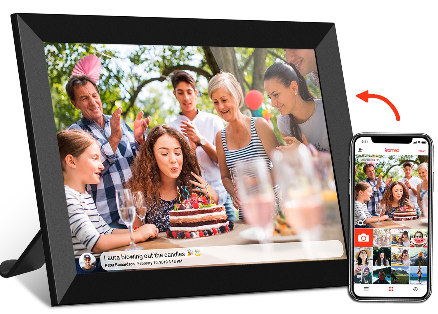
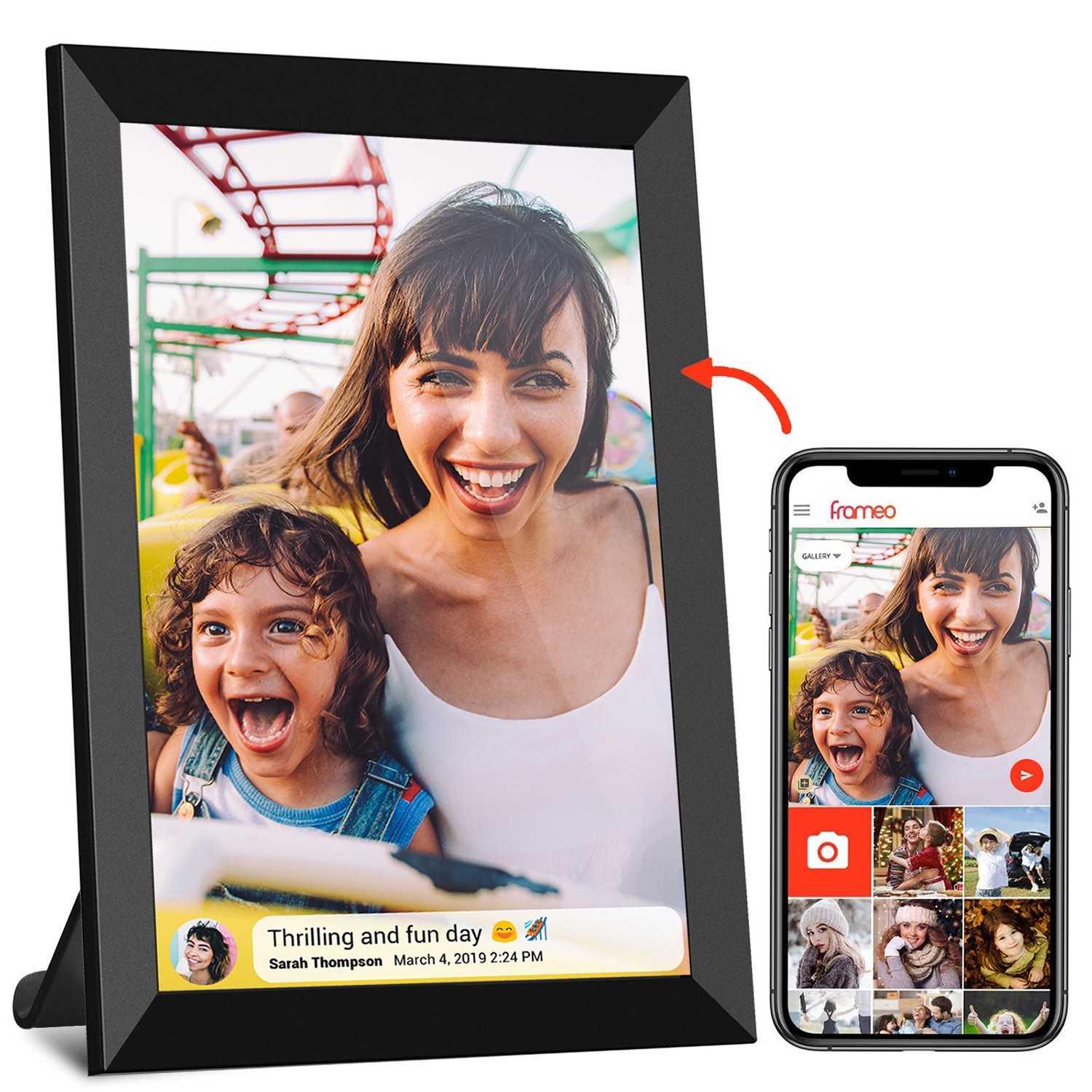
| 4:3 | Older tablets, some kids tablets, digital photo frames (e.g., frameo wifi digital photo frame) | Reading, classic content, educational apps | More vertical space for text; fits square content well | Black bars for widescreen movies; less ideal for split-screen |
| 16:9 | Most android tablets, digital signage, TVs | Streaming movies/shows, general use, kids' media | Fits modern content; widely supported by apps | Less vertical space for productivity; black bars for older 4:3 content |
| 16:10 | Productivity tablets, portable monitors (e.g., 24.5 inch portable monitor) | Work (documents, split-screen), extended displays | Balances width and height; less scrolling than 16:9 | Not as common as 16:9; some apps may not optimize for it |
| 21:9 | Ultra-wide monitors, high-end digital signage | Immersive gaming, panoramic videos | Stunning for widescreen content; great for multi-tasking | Too wide for most tablets; limited app support; expensive |
| 9:16 (Portrait) | Vertical digital signage, some kiosks | Hallway displays, retail shelves, social media content (e.g., TikTok) | Stands out in vertical spaces; fits mobile-optimized content | Not useful for traditional widescreen videos; limited use cases |
You might wonder: why don't all tablets just use the same ratio? The answer lies in target audiences and market trends. A manufacturer making a kids tablet will prioritize 16:9 because that's what most kids' apps and videos use, ensuring a smooth experience. A company targeting professionals might opt for 16:10 to appeal to users who value productivity over media.
Cost also plays a role. 16:9 panels are mass-produced for TVs, laptops, and tablets, making them cheaper than less common ratios like 16:10. That's why budget android tablets often stick to 16:9—it keeps prices low while still delivering a familiar experience. Premium brands, however, can afford to experiment with ratios like 3:2 (Microsoft's Surface line is a notable example) to differentiate themselves and attract power users.
Then there's the "halo effect" of popular devices. When Apple or Samsung releases a tablet with a certain ratio, competitors often follow suit to avoid confusing consumers. For years, 4:3 was the norm because the original iPad used it, but as 16:9 became dominant in TVs, tablet makers shifted to match, knowing users would expect consistency across their devices.
So, what's next? As technology advances, we might see devices that adapt their aspect ratio on the fly. Foldable tablets, for example, can switch from a 4:3-like ratio (when closed) to a wider 16:9 (when unfolded). Some concept devices even have "stretchy" screens that adjust shape based on content—imagine a screen that narrows to 21:9 when you start a movie, then widens to 16:10 when you open a document.
Software is also evolving to mitigate aspect ratio issues. Many streaming apps now offer "zoom to fill" or "stretch" options, though these can distort content. More promising is AI-powered cropping, where algorithms intelligently reframe older 4:3 content to fit widescreen without cutting off important details (think centering a person's face in a classic TV show instead of leaving black bars on the sides).
For now, though, the best we can do is choose a ratio that aligns with how we use our devices most. If you're a movie buff, 16:9 is a no-brainer. If you work from your tablet, 16:10 or 3:2 will save you time. And if you're buying for a child, 16:9 ensures they can use all their favorite apps without frustration.
Aspect ratio might not be the first thing you check when shopping for an android tablet, kids tablet, or digital signage—but it should be. It's the invisible hand that shapes your visual experience, turning a device from a tool into an extension of how you live, work, and play. Whether you're watching a movie, helping your child with homework, or setting up a store display, the right ratio will make everything feel smoother, more intuitive, and just plain better.
So, the next time you're comparing specs, pause at that "aspect ratio" line. Ask yourself: What do I use my screen for most? Then pick the ratio that fits your life—not just the latest trend. After all, the best visual experience isn't about the numbers on a spec sheet—it's about how the screen makes you feel every time you turn it on.