Between DCI-P3 and sRGB in digital photo frames, which color gamut is more suitable for enterprises?
In today's fast-paced business world, first impressions matter more than ever. For enterprises, every touchpoint with clients, partners, or employees is an opportunity to reinforce brand identity—and few tools are as visually impactful as digital displays. Among these, the humble
digital photo frame has evolved from a personal keepsake into a powerful corporate communication tool. Whether it's showcasing product launches in a retail lobby, displaying company milestones in a headquarters reception area, or sharing real-time updates in meeting rooms, a well-chosen
digital photo frame can elevate a brand's presence. But here's the catch: not all displays are created equal, and one critical factor often overlooked is color gamut. Specifically, when it comes to enterprise use, the choice between DCI-P3 and sRGB can make or break how your content is perceived. Let's dive into this colorful debate and figure out which gamut truly works harder for your business.
What Even *Is* a Color Gamut, Anyway?
Before we pit DCI-P3 and sRGB against each other, let's get back to basics. A color gamut is essentially the range of colors a display can reproduce. Think of it as a painter's palette: some palettes have more vibrant blues and reds, while others stick to a more standard set of hues. For enterprises, this isn't just about "looking pretty"—it's about accuracy. If your company logo uses a specific shade of "corporate blue," you want that blue to appear exactly as intended on every screen, whether it's a 21.5 inch
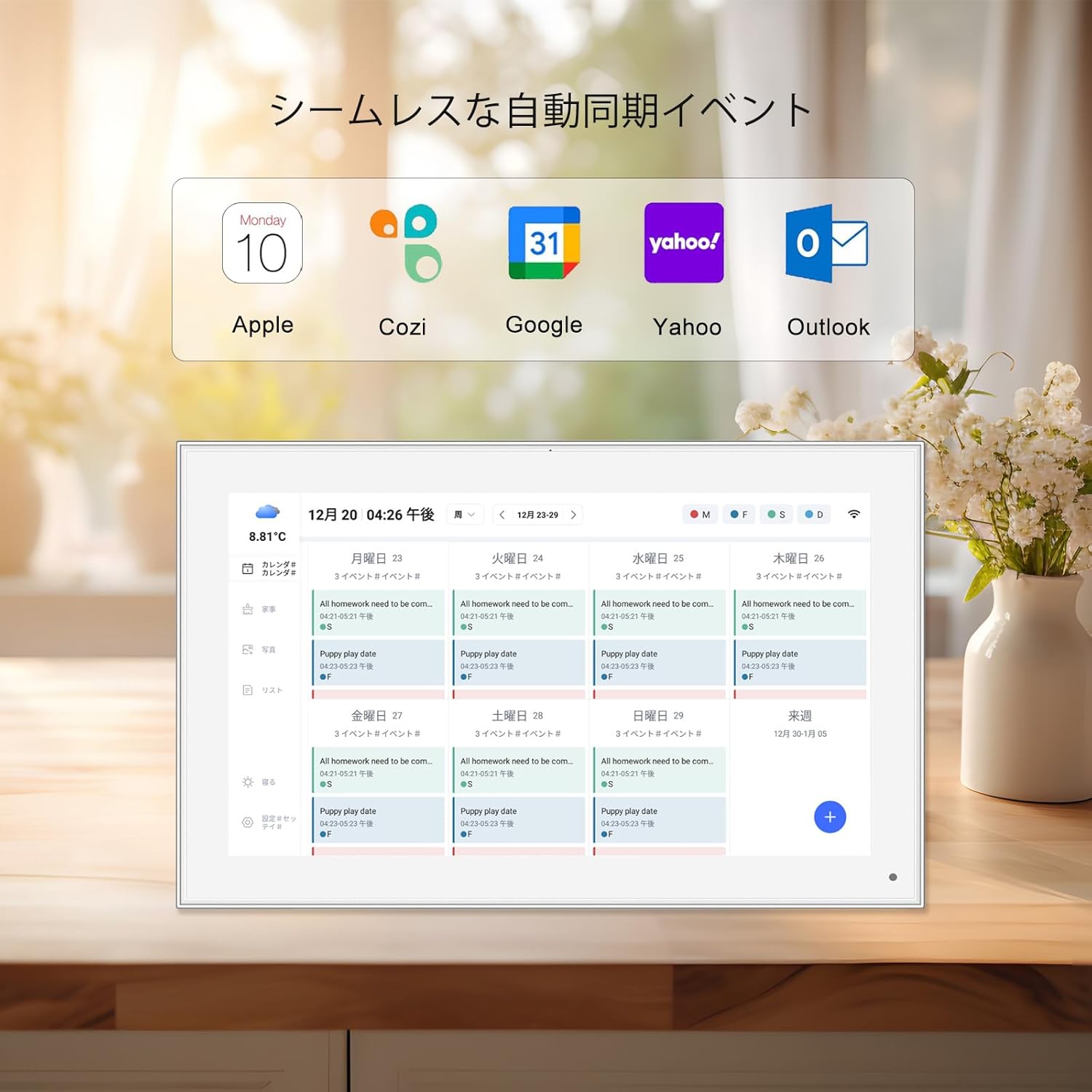
wifi digital photo frame in the lobby or a 10.1 inch frameo
wifi digital photo frame in a satellite office. The wrong color gamut can wash out your brand's identity, make product photos look unprofessional, or even confuse clients who associate certain colors with your services.
sRGB: The Reliable Workhorse of Color Standards
Let's start with the veteran in the room: sRGB. Developed in the late 1990s by Microsoft and HP, sRGB was designed as a universal color standard for digital devices. It's the default for most monitors, printers, and yes, many consumer-grade digital photo frames. Why? Because it's simple, consistent, and widely compatible. sRGB covers about 72% of the visible color spectrum (as defined by the CIE 1931 color space), focusing on the colors most commonly used in everyday content—think website images, office documents, and standard digital photos. For enterprises, this compatibility is a big plus. If your team creates content using standard design tools like Adobe Photoshop (which defaults to sRGB) or Microsoft Office, your visuals will translate seamlessly to an sRGB display. No weird color shifts, no unexpected dullness—just reliable consistency.
Take, for example, a mid-sized tech firm using a
Frameo cloud frame in their meeting rooms. The frame is used to display slideshows of quarterly reports, employee spotlights, and client testimonials. Since most of this content is created in PowerPoint or Canva (both sRGB-centric), an sRGB
digital photo frame ensures that charts, graphs, and text remain crisp and true to their original design. There's no need for specialized calibration or expensive color-matching tools—what you see on your laptop is what everyone in the meeting sees on the frame. For enterprises with distributed teams, this simplicity is a lifesaver. A remote employee in Tokyo can send a presentation to the
Frameo cloud frame in the New York office, confident that the colors will look the same on both ends.
DCI-P3: The Vibrant Upstart for Visual Impact
Now, enter DCI-P3. Originally developed for the film industry (DCI stands for Digital Cinema Initiatives), this color gamut was built to reproduce the rich, vivid colors seen in movies. It covers about 25% more of the color spectrum than sRGB, with a particular focus on deeper reds, greens, and blues. Imagine a sunset scene: in sRGB, the oranges might look warm but muted; in DCI-P3, they'd glow with the same intensity as the real thing. For enterprises that rely on visual storytelling—think retail brands, creative agencies, or luxury hotels—this extra vibrancy can be a game-changer. A 21.5 inch
wifi digital photo frame in a high-end boutique, displaying images of new clothing lines, would make fabrics look softer, colors more saturated, and details (like embroidery or texture) pop in a way that sRGB simply can't match.
But DCI-P3 isn't just about "pop." It's also about accuracy in specific contexts. For example, healthcare android tablets (though not a
digital photo frame, the principle applies) use DCI-P3 to display medical images where subtle color differences can indicate health issues. Similarly, a marketing agency showcasing a client's new car line on a 10.1 inch frameo
wifi digital photo frame would want the vehicle's metallic paint to shimmer exactly as it does in real life—something DCI-P3 excels at. The downside? DCI-P3 is less universally compatible. If your content isn't created in a DCI-P3 workflow (using tools like Adobe Premiere Pro or specialized color-calibrated monitors), you might end up with oversaturated colors or "clipped" highlights (areas where colors become too bright and lose detail). It also tends to be pricier, as displays with DCI-P3 support require better panel technology and backlighting.
Enterprise Needs: Beyond "Pretty Colors"
To decide between DCI-P3 and sRGB, enterprises need to look beyond specs and ask: What are we using the
digital photo frame for? Who is our audience? And what's our content workflow? Let's break down the key considerations:
Brand Consistency:
If your enterprise has strict brand guidelines—think Coca-Cola red or Tiffany blue—color accuracy is non-negotiable. sRGB, being the industry standard, is safer here. Most brand assets (logos, marketing materials) are designed in sRGB, so using an sRGB
digital photo frame ensures there's no drift. However, if your brand prides itself on bold, eye-catching visuals (like a sports apparel company or a tech startup with a vibrant logo), DCI-P3 could make your brand stand out in a crowded lobby or trade show booth.
Audience Perception:
Consider where the
digital photo frame will live. A 10.1 inch frameo
wifi digital photo frame in a doctor's office waiting room, displaying calming nature scenes, might benefit from sRGB's softer, more balanced colors—DCI-P3's intense greens could feel overwhelming. On the other hand, a retail store using a 21.5 inch
wifi digital photo frame to showcase summer swimwear would want the bright blues and yellows to pop, making DCI-P3 the better choice.
Content Workflow:
If your team uses basic design tools (Canva, Google Slides) and shares content via email or cloud drives, sRGB is the way to go. It's plug-and-play. But if you have a dedicated design team working with professional software (Adobe Creative Cloud, DaVinci Resolve) and calibrating content for DCI-P3, investing in a DCI-P3
digital photo frame will let that hard work shine. For example, a luxury hotel chain with in-house photographers shooting destination imagery would want those photos to look as stunning on their lobby's
wifi digital photo frame as they do in print ads—DCI-P3 makes that possible.
|
Feature
|
sRGB
|
DCI-P3
|
|
Color Coverage
|
~72% of CIE 1931 spectrum
|
~95% of CIE 1931 spectrum
|
|
Vibrancy
|
Balanced, natural-looking
|
More intense reds, greens, blues
|
|
Compatibility
|
Widely supported (websites, office tools, consumer devices)
|
Best with professional content (film, high-end photography)
|
|
Enterprise Use Cases
|
Meeting rooms, internal communications, brand consistency
|
Retail displays, luxury branding, visual storytelling
|
|
Cost
|
More affordable
|
Higher (requires advanced panel tech)
|
Real-World Enterprise Scenarios: Choosing the Right Gamut
Let's put this into practice with a few examples. These scenarios will show how the choice between DCI-P3 and sRGB plays out in real enterprise settings, incorporating some of the digital photo frames and tools you might already be considering.
Scenario 1: Corporate Headquarters Reception Area
A multinational finance firm wants to greet visitors with a polished, professional display. They'll be showing a rotating slideshow of company milestones, executive bios, and partner logos—all created in-house using Microsoft PowerPoint and Adobe Illustrator (both sRGB-based). For this, a
21.5 inch wifi digital photo frame
with sRGB support is ideal. It ensures that their navy blue logo (a core brand color) doesn't shift to purple, and the charts in their "Year in Review" presentation remain clear and easy to read. Since the frame is connected to their network via wifi, the marketing team can update content remotely without worrying about color calibration issues.
Scenario 2: High-End Retail Boutique
A luxury fashion brand wants to showcase their new summer collection in store. Their in-house photography team has shot the clothes on location in the Maldives, using professional cameras calibrated to DCI-P3. The goal is to make the fabrics (silk, linen, cotton) look tactile and the colors (coral, turquoise, sand) as vivid as they are in person. Here, a
10.1 inch frameo wifi digital photo frame
with DCI-P3 support is the way to go. When customers walk past the frame, the images will feel almost lifelike—making the clothes more appealing and encouraging purchases. The Frameo cloud frame feature also lets the brand update content in real time, swapping out sold-out items with new arrivals without needing to visit each store.
Scenario 3: Healthcare Clinic Waiting Room
A pediatric clinic wants to create a calming environment for young patients and their parents. They plan to display soft nature scenes (forests, beaches, meadows) and educational videos about child health. Since the content is sourced from stock photo sites (most of which use sRGB) and created in Canva, an sRGB
wifi digital photo frame
is the best fit. The muted, natural colors will help reduce anxiety, and the frame's wifi connectivity allows the clinic staff to update videos without disrupting patient flow. There's no need for DCI-P3 here—vibrant colors might overstimulate young children, and the stock photos won't benefit from the wider gamut.
The Verdict: It's About Alignment, Not Superiority
So, which color gamut is more suitable for enterprises? The answer isn't "DCI-P3 is better" or "sRGB is outdated"—it's about aligning the gamut with your specific needs. sRGB is the safe, versatile choice for most enterprises, especially those focused on internal communications, brand consistency, or content created with standard tools. It's affordable, easy to manage, and ensures your visuals look as intended across devices. DCI-P3, on the other hand, is a powerhouse for enterprises that live and die by visual storytelling—retail, luxury, creative industries—where vibrant, lifelike colors can drive engagement and sales. It requires a bit more investment in both hardware and content creation, but the payoff in visual impact can be significant.
When shopping for a
digital photo frame, look beyond the specs sheet. Ask the manufacturer about color calibration options, check if the frame supports both gamuts (some high-end models do), and—most importantly—test it with your actual content. A
Frameo cloud frame
might catch your eye with its sleek design, but if your team's presentations are in sRGB, DCI-P3 support will go unused. Conversely, a budget sRGB frame might save you money, but if your product photos lose their luster on screen, you're missing out on potential customers.
In the end, the best color gamut for your enterprise is the one that makes your brand look its best, connects with your audience, and fits seamlessly into your workflow. Whether it's the reliable consistency of sRGB or the vibrant punch of DCI-P3, the right choice will turn your
digital photo frame from a simple display into a powerful tool for storytelling and connection.