Think about the last time you picked up a tablet or sat down at a desktop screen. Chances are, you adjusted how you held it or positioned it based on what you were doing. Maybe you flipped it vertically to read a long article, scrolled through social media with your thumb gliding up and down, or kept it horizontal to watch a video. Our relationship with screens is deeply tied to how they fit the content we care about—and more importantly, how they fit the natural way we interact with the world. In recent years, there's been a quiet shift in the design of desktop tablet terminals, particularly around aspect ratios. Among the options, 16:10 has emerged as a popular choice, but the question remains: Is this aspect ratio truly more suitable for the vertical screen interaction that's become second nature in our daily lives?
To unpack this, we need to start by understanding what aspect ratio really means. It's the proportional relationship between a screen's width and height, and it shapes everything from how much text fits on a page to how comfortably you can reach icons with your thumb. For decades, 16:9 dominated the tech world—it's the standard for most TVs and monitors, optimized for widescreen video. But as tablets and hybrid devices blurred the lines between work and leisure, 16:10 began to gain traction. Unlike 16:9, which prioritizes width, 16:10 offers a taller canvas. And in a world where we increasingly interact with screens vertically—whether for reading, messaging, or managing daily tasks—this extra height might just be the key to a more intuitive experience.
Let's start with the obvious: humans are vertical beings. Our eyes move up and down more naturally than side to side, and our hands—especially when holding a device—find it easier to scroll vertically than horizontally. Think about your smartphone: when was the last time you used it in landscape mode for anything other than videos or games? For most of us, it's vertical 90% of the time. We check emails, browse news, scroll through Instagram, and even work on documents with our phones upright because it feels natural. That same instinct is spilling over into larger devices, including desktop tablets.
Desktop tablets, unlike traditional laptops, are designed to be flexible. They're meant to sit on desks, be carried around, or even mounted on walls, adapting to how you need to use them. In many cases, vertical orientation makes sense here too. Imagine a teacher using a tablet to display a lesson plan: a taller screen means more lines of text without scrolling, keeping students focused. Or a retail employee checking inventory on a desktop tablet l-type series—vertical mode lets them see more product entries at once, speeding up their workflow. Even in casual use, like following a recipe while cooking, a vertically oriented tablet keeps the steps visible without constant swiping.
This shift isn't just about preference; it's about efficiency. Research has shown that vertical screens reduce the number of eye movements required to absorb information, especially for text-heavy content. When you're reading a report or drafting an email, a taller screen means fewer page breaks and less scrolling. For professionals who spend hours on documents, this translates to less eye strain and more productivity. It's no wonder that industries like healthcare and education are increasingly adopting vertical screen setups—they're simply more aligned with how we process information.
To understand why 16:10 might be better for vertical interaction, let's compare it to the other common players: 16:9 and 4:3. Each has its strengths, but when it comes to vertical use, the differences become clear.
| Aspect Ratio | Vertical Screen Height (Relative to Width) | Best For | Limitations for Vertical Interaction |
|---|---|---|---|
| 16:9 | Shorter (9 units tall for every 16 units wide) | Widescreen video, gaming, horizontal productivity | Less vertical space; requires more scrolling for text/documents. Feels "squashed" in vertical mode. |
| 16:10 | Taller than 16:9 (10 units tall for every 16 units wide) | Reading, social media, vertical productivity, hybrid use | Slightly less ideal for ultra-widescreen video compared to 16:9, but minimal trade-off for most users. |
| 4:3 | Squarer (3 units tall for every 4 units wide) | Legacy software, certain photo editing, older content | Less horizontal space for multitasking; feels outdated for modern, vertically optimized apps. |
Take 16:9 first. It's great for movies—no black bars, immersive widescreen—but in vertical mode, its short height becomes a liability. A 10.1 inch vertical screen tablet pc with a 16:9 ratio, for example, would have a much shorter vertical dimension than the same size with 16:10. That means when you're reading an article, you might only see 10 lines of text before needing to scroll, whereas a 16:10 screen could fit 12 or 13. Over the course of a long document, those extra lines add up to less friction and more focus.
Then there's 4:3, the old standard for CRT monitors and early tablets. It's squarer, which can feel roomy for some apps, but it lacks the vertical stretch that modern users crave. A 4:3 screen in vertical mode is almost square, which limits how much content you can stack vertically. It also feels less intuitive for scrolling—your thumb has to move more horizontally to navigate, which can be tiring over time. 4:3 has its niche, but for the vertical-centric tasks we prioritize today, it's often more of a throwback than a solution.
16:10 hits a sweet spot. It's not as tall as 3:2 (another emerging ratio, common in some laptops), but it balances width and height in a way that works for both vertical and horizontal use. When flipped vertically, it offers enough height to minimize scrolling without sacrificing the horizontal space needed for multitasking. For desktop tablets, which are often used in both orientations, this flexibility is key. You can flip it horizontal to watch a video during lunch, then vertical to draft a report in the afternoon—no compromises.
Theory is one thing, but real-world application is where 16:10 truly proves its worth. Let's dive into a few scenarios where vertical interaction on a 16:10 desktop tablet makes a tangible difference—starting with the desktop tablet l-type series , a design built for stationary use.
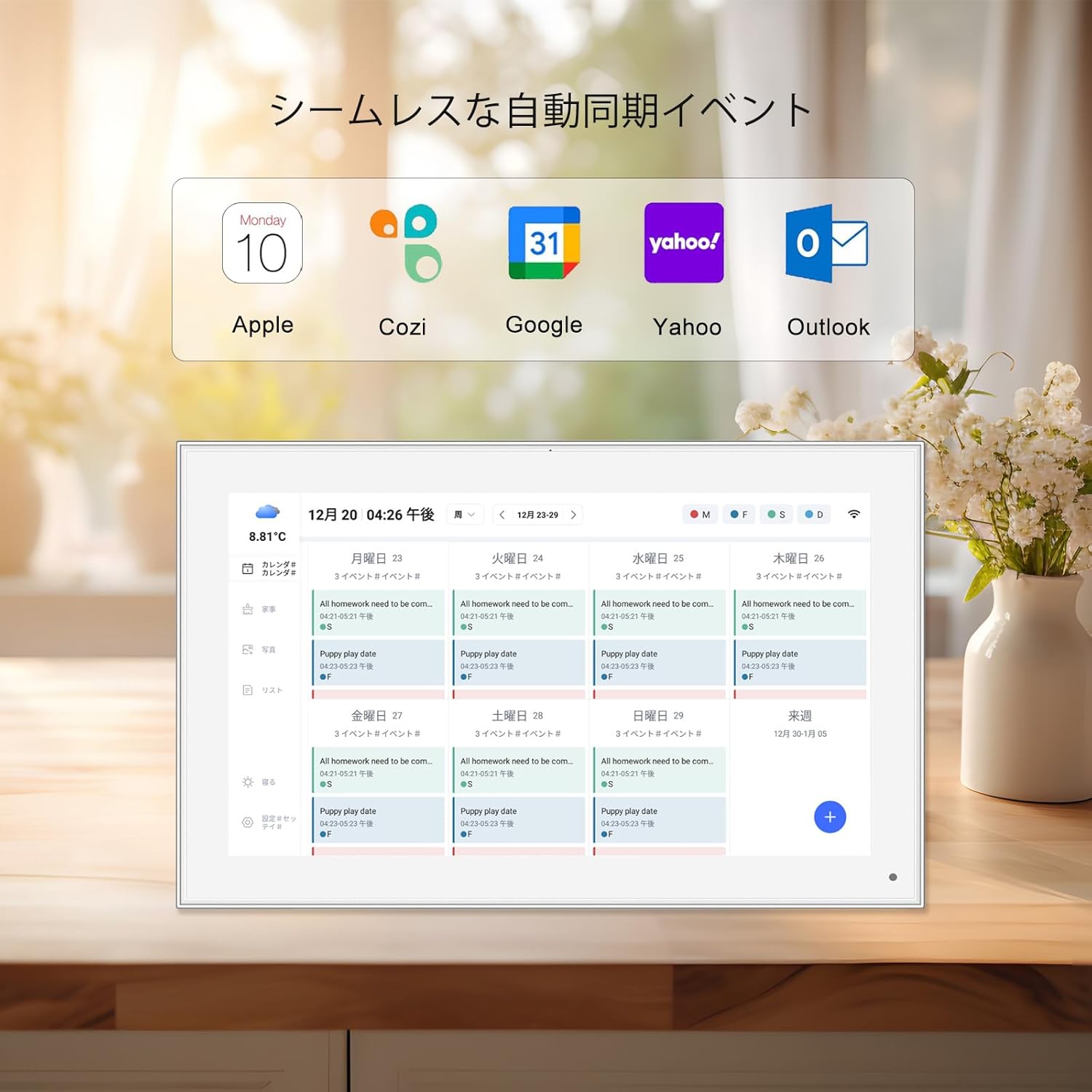
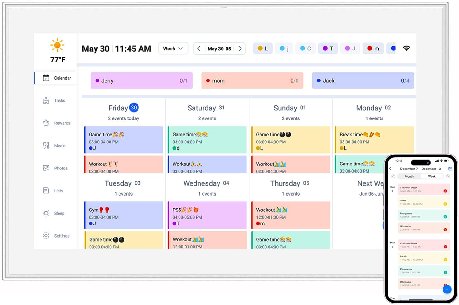
Imagine walking into a modern office. On many desks, you'll find L-type tablets—devices propped up at an angle, acting as secondary monitors or standalone workstations. These tablets are rarely used for video; instead, they're for checking emails, monitoring project dashboards, or keeping chat apps open. In vertical mode, a 16:10 L-type tablet becomes a hub of productivity. The taller screen lets you stack your inbox, calendar, and to-do list without overlapping windows, and the L-shape design keeps it stable and easy to glance at while working on a laptop. Employees report spending less time switching between apps and more time focused on tasks—all because the screen orientation aligns with how they naturally process information.
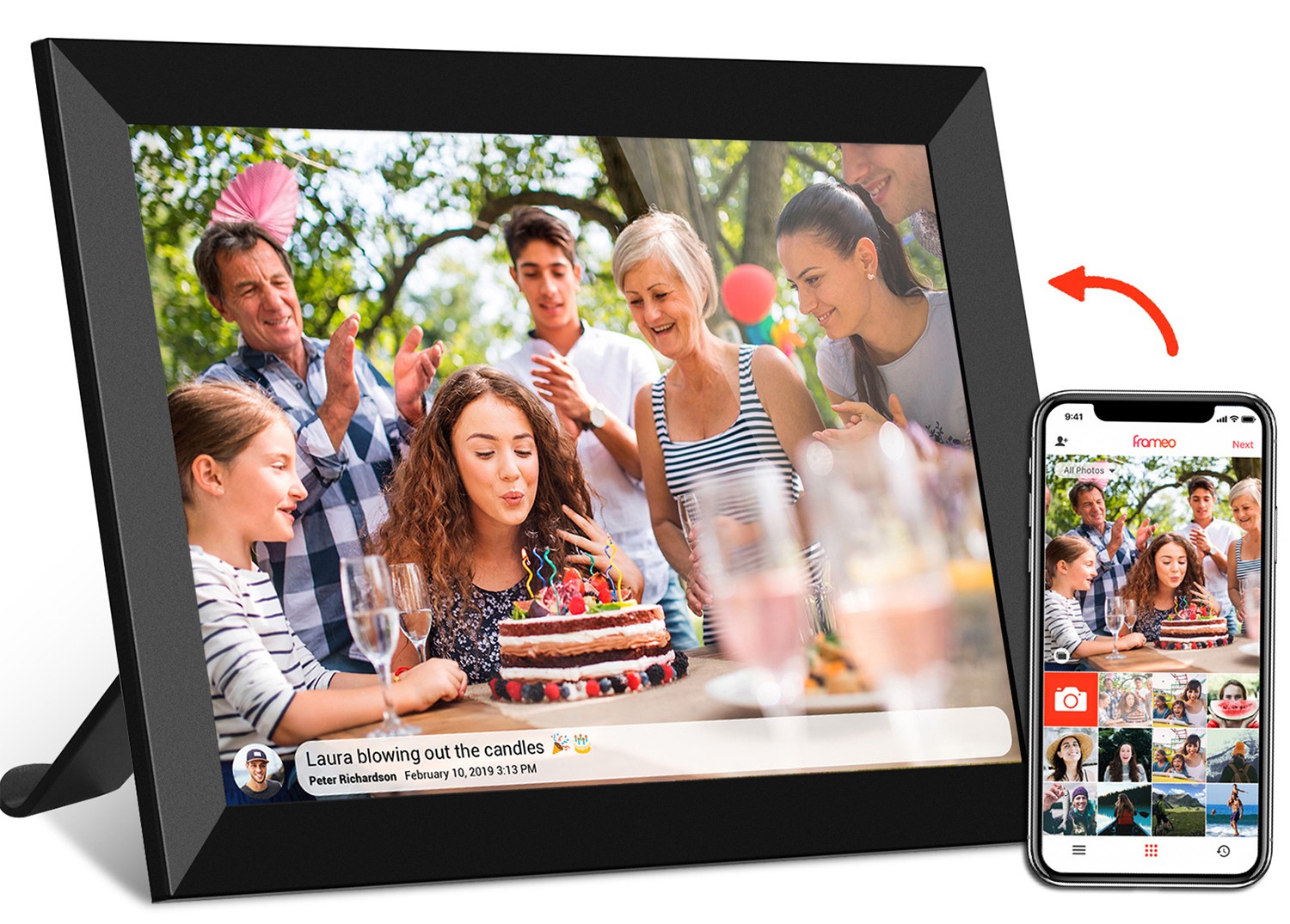
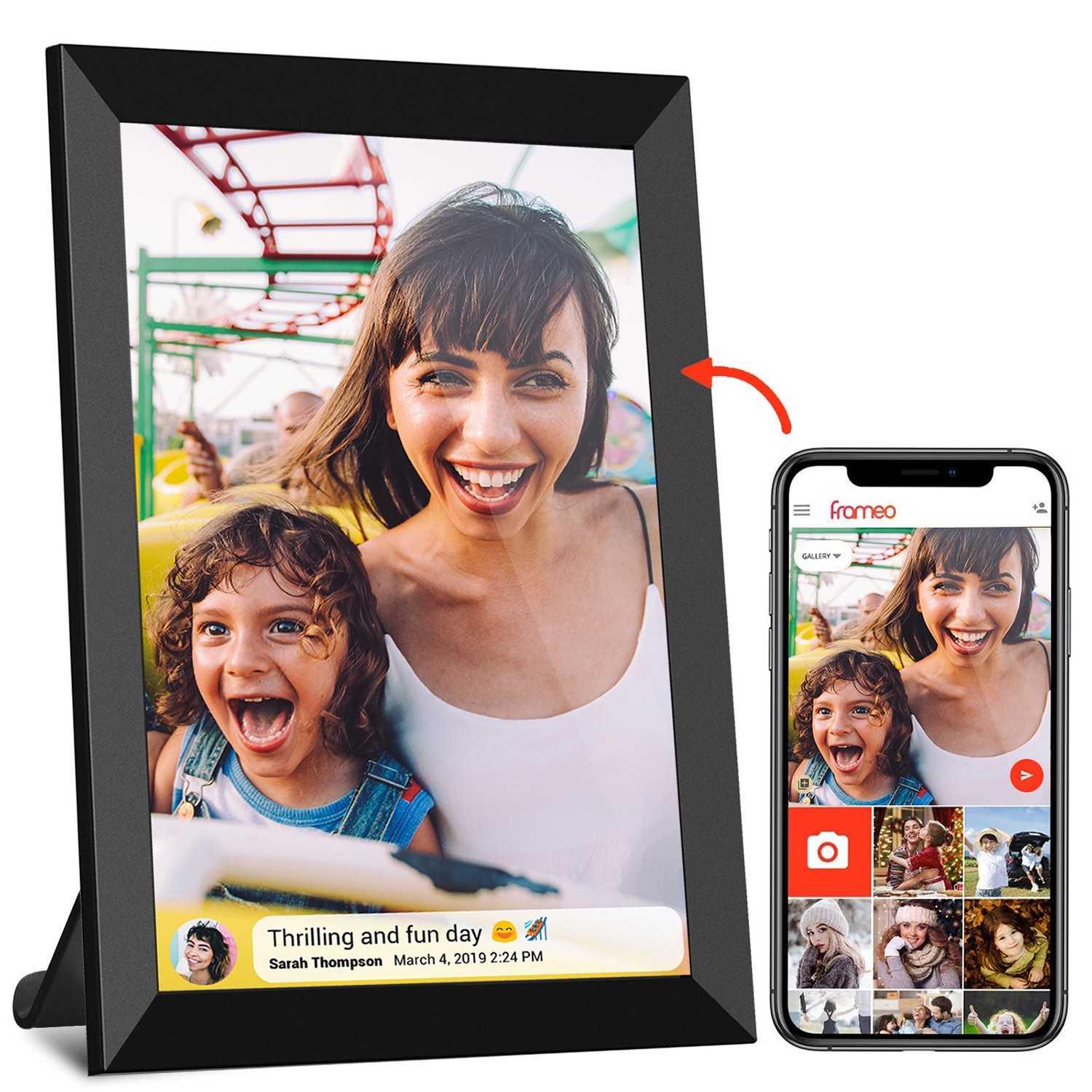
Then there's android tablet digital signage , a growing trend in retail, healthcare, and hospitality. Walk into a coffee shop, and you might see a vertical tablet displaying the menu—tall enough to list all drinks and prices without scrolling. In a hospital, a vertical digital signage tablet could show patient schedules or wayfinding maps, with text large enough to read from a distance. 16:10 is ideal here because it balances readability with space efficiency. A 21.5 inch wifi digital picture frame (a type of digital signage) with 16:10 in vertical mode can display more menu items or announcements than a 16:9 screen of the same size, making it more useful for both businesses and customers.
Even in personal use, the 16:10 vertical advantage stands out. Take the 10.1 inch vertical screen tablet pc , a popular size for home and on-the-go use. A parent using it to manage family schedules can see the entire week at a glance in vertical mode, with room for notes and reminders. A student studying for exams can split the screen between a textbook PDF and flashcards, with the extra height ensuring neither feels cramped. And for seniors or those with limited dexterity, the reduced scrolling means less strain on hands and wrists—a small detail that makes a big difference in daily use.
At the end of the day, the best technology fades into the background—it feels like an extension of how we already work and live. That's the magic of a well-chosen aspect ratio: when it fits your needs, you don't even notice it. But when it doesn't, every interaction feels like a fight against the screen.
Consider thumb reach, a critical factor in touchscreen usability. On a vertical tablet, most users interact with their dominant thumb, reaching up and down the screen. A taller 16:10 screen, when held vertically, keeps more icons and buttons within the "comfortable zone"—the area your thumb can reach without straining. In contrast, a 16:9 screen in vertical mode has a shorter height, so designers often cram buttons at the top or bottom, forcing users to stretch or reposition their grip. This might seem minor, but over hours of use, it leads to fatigue and frustration.
Accessibility is another angle. For users with limited mobility or vision, a 16:10 vertical screen can be a game-changer. Larger text is easier to read when there's more vertical space, reducing the need to zoom in and pan around. Apps designed for vertical use, like screen readers or voice assistants, also benefit from the taller canvas, as they can display more context at once. In healthcare settings, for example, a 16:10 vertical tablet used by nurses can show patient charts with larger text and more details, reducing the risk of errors and improving care.
Even app developers are taking notice. More and more apps—from productivity tools like Microsoft 365 to social media platforms like TikTok—are optimizing for vertical interfaces. They're adding features like vertical split-screen, taller keyboards, and adaptive layouts that take advantage of extra height. For these apps, a 16:10 screen in vertical mode is like giving them a bigger canvas to work with—one that feels natural, not forced.
Of course, no aspect ratio is without trade-offs. 16:10 isn't a one-size-fits-all solution, and there are scenarios where it might not be the best choice. For users who primarily watch movies or play widescreen games on their desktop tablets, 16:9 will still feel more immersive—no black bars, no letterboxing. And some legacy software, designed for 4:3 or 16:9, might not scale perfectly to 16:10, leading to stretched icons or awkward spacing.
But here's the thing: most of us don't use our devices for just one task. We're switching between work, entertainment, and communication constantly, and 16:10 adapts better to this hybrid lifestyle. The minor inconvenience of thin black bars during a movie is easily outweighed by the daily benefits of extra vertical space for reading, messaging, and productivity. Plus, as more developers optimize for 16:10, those legacy app issues are becoming fewer and farther between.
Another concern is cost. 16:10 screens were once pricier to manufacture than 16:9, but as demand has grown, that gap has closed. Today, most desktop tablet manufacturers offer 16:10 as a standard option, and many even prioritize it in their flagship models. For consumers, this means you don't have to pay a premium for a better vertical experience—it's becoming the default.
So, is the 16:10 aspect ratio of desktop tablet terminals more suitable for vertical screen interaction? The answer, based on how we use screens today, is a resounding yes. It's not just about preference; it's about aligning technology with human behavior. We interact vertically—our eyes, hands, and daily tasks all lean into that orientation—and 16:10 provides the extra height needed to make that interaction seamless.
From the desktop tablet l-type series keeping offices productive to android tablet digital signage making public spaces more informative, 16:10 is proving its worth in real-world settings. It balances the best of both worlds: enough width for occasional horizontal use and enough height for the vertical tasks that dominate our days. And as app developers and manufacturers continue to prioritize vertical optimization, this advantage will only grow.
At the end of the day, technology should adapt to us—not the other way around. 16:10 desktop tablets do just that. They're a reminder that the best innovations aren't about flashy features; they're about making the everyday feel a little easier, a little more intuitive, and a lot more human. So the next time you pick up a tablet or sit down at a desktop terminal, take a moment to notice the aspect ratio. Chances are, if it's 16:10 and you're using it vertically, you'll wonder how you ever lived without that extra height.