There's nothing quite like gathering friends for a movie night, prepping a slideshow of family photos for a reunion, or setting up digital signage to showcase your brand—until the colors on screen look off. Maybe the sunset in that vacation photo appears more magenta than gold, or the company logo on your office digital signage leans too blue. That's color deviation, and it's not just annoying; it can undermine the whole point of using a projector. Whether you're a home theater enthusiast, a small business owner managing digital displays, or someone who just wants their projector to work as intended, understanding why colors go wrong and how to fix them is key. Let's dive into the common causes of projector color deviation and walk through practical calibration methods to get those hues back on track.
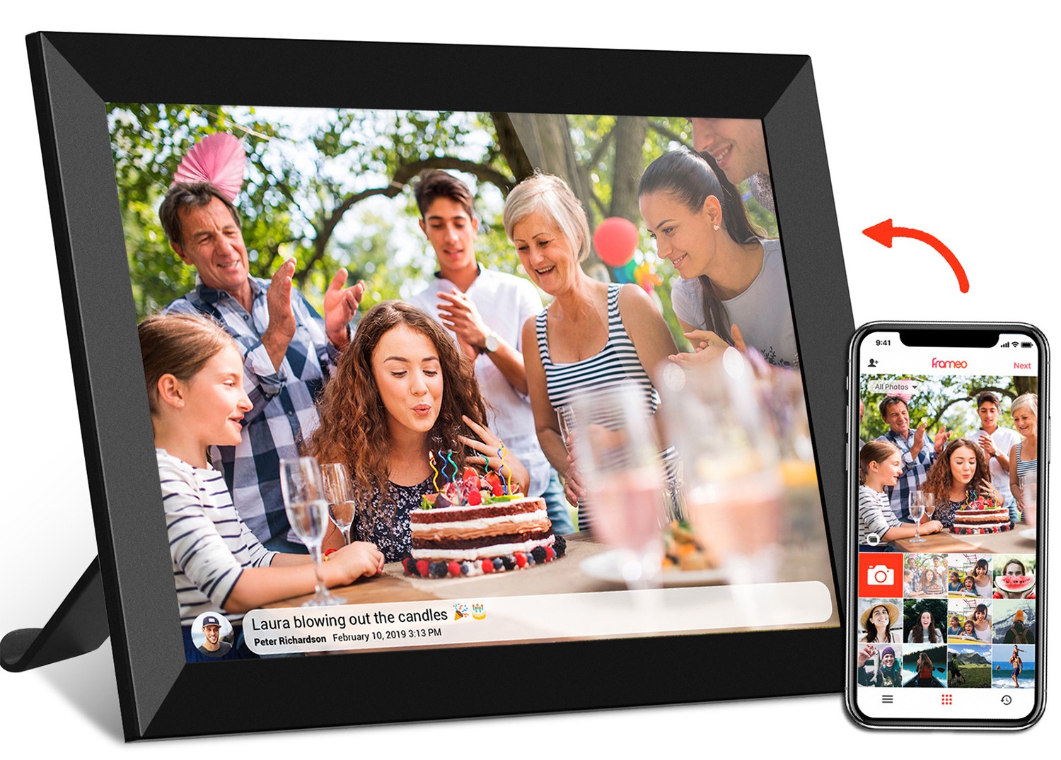
Before we get into the "why" and "how," let's talk about the "so what." Color accuracy isn't just for professional photographers or cinephiles. Think about it: A teacher using a projector to show science diagrams needs greens and blues to distinguish between land and water. A café owner displaying a menu on digital signage relies on true-to-life food colors to make customers hungry. Even a frameo wifi digital photo frame, though smaller than a projector, faces similar issues—imagine grandma's birthday photo looking washed out because the colors are misaligned. For projectors, the stakes are higher because they're often the centerpiece of visual experiences. Get the colors right, and everything feels immersive; get them wrong, and it's like watching a movie with a filter you can't turn off.
Color deviation rarely happens overnight. It's usually a mix of small issues that add up over time, or simple oversights in setup. Let's break down the most likely culprits.
Your projector's lamp is the heart of its light output, and like any heart, it ages. Most projector lamps last 2,000–5,000 hours, but long before they burn out, their color temperature shifts. New lamps typically hover around 6500K (a neutral white), but as they wear, they may drop to 5000K (warmer, more yellow) or spike to 7000K (cooler, bluer). This shift throws off the entire color balance. For example, a lamp that's too warm might make skin tones look jaundiced, while a cooler lamp could wash out reds and oranges. If you've had your projector for a few years and haven't replaced the lamp, this is often the first place to look.
Projectors don't exist in a vacuum—your room's lighting, wall colors, and even temperature can mess with how colors appear. Ambient light is a big offender: sunlight streaming through windows or bright overhead lights wash out colors, making reds look pink and blues look gray. Dark rooms are better, but even then, walls painted in bold colors (like red or blue) can reflect onto the screen, tinting the image. Temperature matters too; extreme heat or cold can affect the projector's internal components, like the color wheel in DLP projectors or LCD panels in LCD models, leading to inconsistent color output.
Most projectors ship with "out-of-the-box" settings optimized for quick setup, not accuracy. Modes like "Dynamic" or "Vivid" crank up brightness to make the image pop in stores, but they often skew colors toward cooler tones to appear brighter. Even if you've adjusted settings before, accidental resets (from power outages or firmware updates) can revert them to factory defaults. Other common missteps? Cranking contrast too high, which crushes blacks and bleeds colors, or setting color temperature to "Cool" when you need "Warm" for movies. These small tweaks add up fast.
Sometimes, the issue is physical. For DLP projectors, the color wheel—responsible for splitting white light into red, green, and blue—can develop cracks or slow down, leading to color banding or "rainbow effects." LCD projectors rely on three separate panels (one for each color), and if these panels get misaligned (a common issue after moving the projector), colors overlap incorrectly, creating a fuzzy, off-kilter image. Even the lens can cause problems: dust buildup or scratches scatter light, making colors look dull or uneven. And let's not forget cables—old HDMI cords or loose connections can introduce signal interference, leading to color noise or "sparkles" in the image.
If you're using a projector for digital signage—say, in a mall, restaurant, or office—you face extra challenges. These projectors run for hours daily, accelerating lamp aging. They're also exposed to more dust and varying temperatures, which can degrade internal components faster. Plus, commercial content often uses brand-specific colors (think Coca-Cola red or Tiffany blue), so even a slight deviation can make your signage look unprofessional. Models designed for digital signage, like some android tablet-powered displays, often have better color stability, but they're not immune to these issues.
Calibrating a projector might sound technical, but it's totally doable at home with basic tools—or even just your eyes and a little patience. Let's walk through the process, starting with the simplest fixes and moving to more advanced tweaks.
Before diving into settings, do a little prep work:
-
Clean the lens:
A dusty lens scatters light, making colors look hazy. Use a microfiber cloth (the same kind for glasses) to wipe it gently in a circular motion.
-
Warm up the projector:
Lamps need 20–30 minutes to reach stable brightness and color temperature. Turn it on and let it run while you prep the room.
-
Control ambient light:
Close curtains, turn off overhead lights, and use blackout blinds if possible. If you can't darken the room completely, use dim, warm-toned lamps (avoid cool white LEDs, which wash out colors).
-
Check the screen:
Ensure your projection screen is clean and neutral (white or gray). A yellowed or stained screen will tint everything, no matter how well you calibrate.
Most projectors come with preset color modes, and choosing the right one is half the battle. Here's a quick breakdown of common modes to help you decide:
| Color Mode | Color Temperature (K) | Brightness (Nits) | Best For |
|---|---|---|---|
| Cinema / Movie | 6500K (neutral) | 200–300 | Dark rooms, movies, photos |
| Natural / Standard | 5500K (warm) | 250–350 | Mixed lighting, everyday use |
| Dynamic / Vivid | 9300K (cool) | 400+ | Bright rooms, sports, gaming |
| Game | 7000K (slightly cool) | 300–500 | Fast response, low input lag |
For most users, "Cinema" or "Natural" mode is a good starting point. Avoid "Dynamic" unless you're in a very bright room—it prioritizes brightness over color accuracy.
Brightness and contrast are the foundation of a good image, and getting them right prevents color distortion. Here's how:
-
Brightness:
Displays how dark the blacks are. Use a black and white test pattern (you can find free ones online by searching "projector brightness test pattern") and set brightness so that black areas look like true black (not gray) but still show details (like shadows in a dark scene). If blacks look gray, lower brightness; if you lose shadow details, raise it slightly.
-
Contrast:
Controls how bright the whites are. Use a white test pattern and adjust contrast until whites are bright but not "clipped" (no pure white areas losing detail). If text or white objects look washed out, lower contrast; if they're too dim, raise it.
Pro tip: Use a scene from a movie or show you know well—something with both dark and bright areas (like a night scene with stars and a lit window). This makes it easier to spot when details get lost.
Color temperature (measured in Kelvin, K) sets the overall "warmth" or "coolness" of the image. Lower K (3000–5000K) is warm (yellow/orange), higher K (6500–9000K) is cool (blue). Most people prefer 6500K (called "D65," the standard for daylight) for accurate colors.
To adjust:
- Use a grayscale test pattern (black to white gradient). The goal is for each shade of gray to look neutral—no color tint. If the grays lean red, lower the temperature; if they lean blue, raise it.
- Tint (sometimes called "hue") adjusts the balance between red and green. Use a color test pattern with skin tones—think of a close-up of a person's face. If skin looks too green, shift tint toward red; if too magenta, shift toward green.
For digital signage or professional use, aim for the exact color temperature specified by your brand guidelines. Some advanced projectors, like the hy300 ultra projector, let you manually adjust red, green, and blue (RGB) levels for pinpoint control.
Many projectors come with built-in calibration wizards that guide you through brightness, contrast, and color adjustments. These tools use on-screen prompts and test patterns, making them great for beginners. To access the wizard:
1. Open the projector's menu (usually via the remote or button on the device).
2. Navigate to "Image" or "Setup," then look for "Calibration" or "Wizard."
3. Follow the on-screen instructions—most will ask you to adjust settings while displaying test patterns.
Keep in mind: Built-in wizards are a starting point, not a perfect solution. They're designed for general use, so you may still need to tweak settings afterward for your specific room.
If you want more precision without spending on professional tools, try these hacks:
-
Test patterns on an android tablet:
Download free test pattern apps (like "Color Test Patterns" or "Projector Calibration") to your android tablet. Connect the tablet to the projector via HDMI, then use its screen to display grayscale, color gamut, and skin tone patterns. This makes it easy to compare the projected image to the tablet's (which is likely more color-accurate).
-
Phone apps as color references:
Apps like "Photometric" or "ColorChecker" let you use your phone's camera to measure color temperature (note: phone cameras aren't perfect, but they'll catch major shifts).
-
Printed color charts:
Print a color gamut chart (search "sRGB color chart printable") and place it next to the projection screen. Adjust colors until the projected chart matches the printed one as closely as possible.
If you're a home theater buff, run a digital signage business, or just want perfection, consider professional calibration. A technician will use tools like colorimeters (which measure color accuracy) and spectrophotometers (which analyze light wavelengths) to dial in settings. Costs range from $100–$300, but the results are worth it—especially for high-end projectors or multi-projector setups (like edge-blended displays for large digital signage). Pro calibrators can also fix issues like color uniformity (where edges of the screen are darker than the center) or gamma correction (how the projector handles midtones).
Calibration isn't a one-and-done fix—projectors need regular care to stay color-accurate. Here's how to keep colors consistent long-term:
-
replace the lamp on schedule:
Most projectors have a lamp hour counter in the menu. replace the lamp when it hits 80% of its rated life (e.g., 2,000 hours for a 2,500-hour lamp) to avoid color shifts.
-
Clean air filters:
Clogged filters trap heat, which can damage internal components and warp colors. Check filters every 3–6 months and vacuum or replace them as needed.
-
update firmware:
Manufacturers release firmware updates to fix bugs, including color-related issues. Check the projector's website for updates and install them via USB or Wi-Fi.
-
Avoid extreme temperatures:
Don't place the projector near heaters, air conditioners, or windows with direct sunlight. Aim for a room temperature between 60–80°F (15–27°C).
-
Store properly if unused:
If you won't use the projector for months (like during a move), store it in a cool, dry place. Remove the lamp and store it separately in a padded container to prevent damage.
Projector color deviation might seem intimidating, but it's usually fixable with a little time and know-how. From adjusting basic settings to using budget tools like an android tablet or test patterns, there's a solution for every skill level and budget. And remember, you don't need perfect color accuracy—just consistency. Whether you're watching movies, showcasing digital signage, or displaying photos on a frameo wifi digital photo frame, the goal is to make the image look natural and true to life. With these tips, you'll be enjoying vibrant, accurate colors in no time—no professional degree required.
So go ahead—grab that remote, fire up your projector, and get ready to see your favorite content in a whole new (color-accurate) light. Your movie nights, presentations, and digital displays will thank you.