Picture this: you walk into a cozy café, and your eye is drawn to a sleek, transparent frame mounted on the wall. It's playing a loop of warm, golden sunsets and laughing friends, the colors so vibrant they make the whole space feel inviting. That's the magic of an
acrylic motion video frame—more than just a display, it's a mood-setter, a storyteller, and a piece of art all in one. But here's the thing: none of that magic works without the right colors. Whether you're using it to showcase family memories at home, promote a brand in a store, or add flair to a special event, the colors in your acrylic dynamic video frame can make or break the impact. In this guide, we're breaking down seven color matching techniques that will turn your frame from "nice" to "unforgettable." And don't worry—we'll keep it simple, relatable, and packed with real-world examples. Let's dive in!
1. Monochromatic Magic: Shades of One Color for Sophistication
Let's start with the basics: monochromatic color matching. This technique uses different shades, tints, and tones of a single base color. Think of a deep navy blue, paired with sky blue, baby blue, and even a touch of gray-blue. Why does this work? Well, monochromatic schemes are inherently harmonious—they feel cohesive and calming, like a well-tailored outfit in one color family. For acrylic motion video frames, this is a game-changer because acrylic's glossy, transparent finish amplifies how light interacts with color. A monochromatic palette won't clash with the frame's own sheen; instead, it'll enhance it, creating a smooth, polished look.
Let's say you're using your acrylic frame in a home office. A monochromatic green scheme—think forest green videos with soft sage overlays and mint accents—can evoke focus and calm, perfect for a workspace. Or, for a wedding reception, a monochromatic blush pink palette (deep rose, dusty rose, pale pink) adds romance without feeling overwhelming. Even in commercial settings, like a high-end boutique, a monochromatic black and white scheme (charcoal, ivory, off-white) exudes elegance, letting the products in your video take center stage. The key here is balance: mix light and dark shades to add depth, so your video doesn't look flat. And remember, acrylic's transparency means lighter tints will glow when backlit, while darker shades will create rich, moody contrast.
2. Complementary Contrast: Opposites Attract for Energy
If monochromatic is the quiet professional, complementary contrast is the life of the party. This technique pairs colors that sit directly opposite each other on the color wheel—think blue and orange, red and green, or purple and yellow. The result? A bold, energetic clash that grabs attention. Why does this work for acrylic dynamic video frames? Because acrylic's clear, reflective surface makes these contrasting colors pop even more. The light bouncing off the acrylic amplifies the brightness of each hue, creating a dynamic, eye-catching effect that's hard to ignore.
Let's take a real example: a café using an
acrylic motion video frame to promote their seasonal menu. A video of fresh orange citrus fruits (like oranges and tangerines) against a deep blue background—complementary colors—will make the food look fresh and appetizing. The blue will make the oranges "pop," and the acrylic's gloss will make both colors shine, almost like they're glowing. Or, for a kids' birthday party, a video of red balloons floating against a bright green grass backdrop (another complementary pair) will feel playful and exciting, keeping little ones engaged. Even in
digital signage—say, a mall directory using purple text on a yellow background—complementary colors ensure the information is readable and attention-grabbing. Just a pro tip: go easy on the saturation. Too much bright red and green might feel harsh, so balance with softer tones (like maroon and sage) if needed. Acrylic frames already add vibrancy, so a little contrast goes a long way!
3. Analogous Harmony: Neighboring Colors for Flow
If complementary contrast is about excitement, analogous harmony is about flow. This technique uses colors that sit next to each other on the color wheel—like blue, blue-green, and green; or red, orange, and yellow. These colors share common undertones, so they blend seamlessly, creating a sense of movement and continuity. For acrylic dynamic video frames, which often play looping videos, this is perfect. Analogous colors guide the viewer's eye smoothly through the content, making the video feel like a cohesive story rather than a jumble of images.
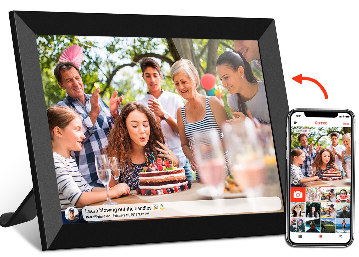
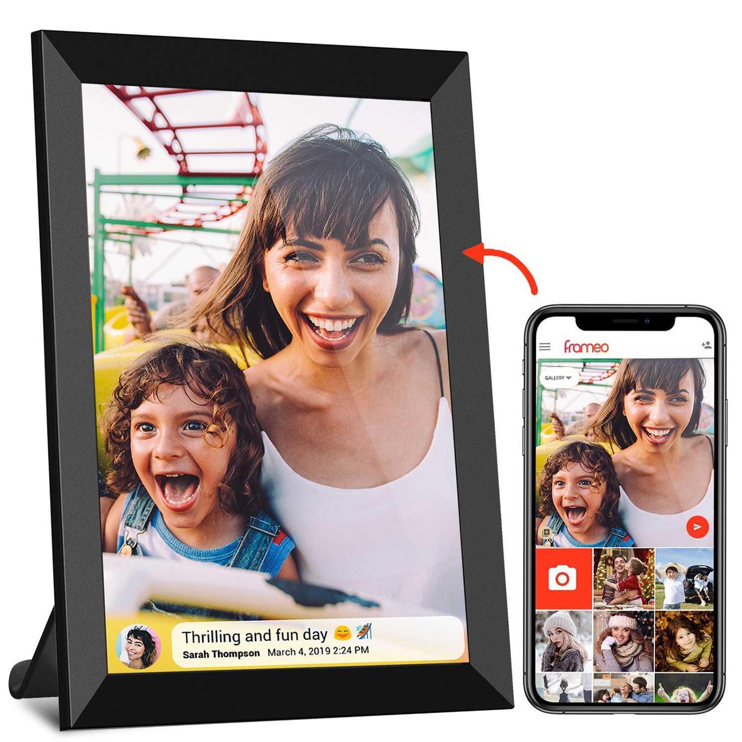
Imagine a frameo
wifi digital photo frame (yes, even photo frames benefit from this!) displaying a slideshow of a beach vacation: soft blues (ocean), teals (waves), and greens (palm leaves). The analogous scheme makes the photos feel connected, like you're right there on the shore. Now, translate that to an
acrylic motion video frame: a video of a forest at dawn, starting with deep pine greens, transitioning to minty sage, then to sky blue as the sun rises. The analogous colors make the transition feel natural, almost meditative. This works wonders in spaces where you want to encourage relaxation, like a spa or a yoga studio. Even in a
video brochure for a travel agency, an analogous palette of warm oranges, reds, and yellows (think desert sunsets) can make viewers feel the warmth of the destination, enticing them to book a trip. The key is to pick one dominant color, then use the neighboring ones as accents—this keeps the palette from feeling muddled. And since acrylic frames have a subtle glow, analogous colors will look even more vibrant, like they're lit from within.
4. Warm vs. Cool Balance: Mixing Temperatures for Depth
Let's talk about temperature: warm colors (red, orange, yellow) and cool colors (blue, green, purple). Warm colors feel energetic, cozy, and inviting—think fireplaces and sunrises. Cool colors feel calm, fresh, and serene—like oceans and forests. The magic happens when you mix them. Warm vs. cool balance adds depth to your acrylic frame's content, preventing it from feeling one-note. For example, a video with cool blue skies and warm golden sunlight streaming through trees? That's balance. The cool blue calms, the warm gold energizes, and together, they create a scene that feels alive.
How does this apply to acrylic motion video frames? Let's say you're using your frame in a restaurant. A video of a cool-toned salad (leafy greens, blueberries, purple cabbage) with a warm golden dressing drizzled over the top—suddenly, the salad looks both fresh and indulgent. The acrylic's transparency will make the cool greens look crisp and the warm dressing look rich, making customers' mouths water. Or, in a healthcare setting, like a clinic waiting room: a video of cool blue waves (calming) with warm yellow flowers (cheerful) can help patients feel relaxed but not sleepy. Even in a
kids instant print camera display, mixing warm reds and yellows (playful) with cool blues (calming) ensures the camera looks fun but not overwhelming for little hands. The trick? Aim for a 60-40 split: 60% of one temperature, 40% of the other. Too much warm can feel chaotic; too much cool can feel cold. Acrylic frames, with their ability to reflect both warm and cool light, will help balance the two perfectly.
5. Neutral Foundations: Letting Accents Steal the Show
Neutrals—white, black, gray, beige, brown—are the unsung heroes of color matching. They don't scream for attention, but they make other colors shine. A neutral foundation technique uses neutrals as the base, then adds one or two bold accent colors to draw focus. Think of a white wall (neutral) with a bright red painting (accent)—the red pops because the white lets it. For acrylic motion video frames, which often have a clear or white acrylic base, this technique is practically built-in. The frame itself is a neutral, so your accent colors will stand out like stars on a dark night.
Let's take a
video brochure for a tech company. The video could have a sleek gray background (neutral) with bright electric blue text and graphics (accent). The gray makes the blue look futuristic and bold, perfect for showcasing new gadgets. In a home setting, an acrylic frame displaying family photos: black and white videos (neutral) with a single accent color, like a bright pink bow in grandma's hair or a yellow umbrella in a rainy-day clip. The neutrals keep the focus on the memories, while the accents add a touch of personality. Even in
digital signage for a gym, a neutral black background with neon green text ("NEW CLASS ALERT!") is impossible to miss—acrylic's gloss will make the green glow, like a neon sign in a dark room. The best part? Neutrals are timeless. A neutral foundation with seasonal accents (pumpkin orange in fall, mint green in spring) lets you update your frame's look without overhauling the entire content. Acrylic's versatility means it pairs with any neutral, so you can't go wrong!
6. Triadic Vibrancy: Three Colors for Bold, Balanced Energy
Ready to go bold? Triadic color matching uses three colors that are equally spaced on the color wheel—like red, yellow, and blue (the primary colors); or purple, green, and orange. These combinations are vibrant and energetic, but because they're evenly spaced, they still feel balanced (no clashing here!). Triadic schemes are perfect for acrylic motion video frames that need to grab attention—think trade shows, retail displays, or party decorations. They're lively, fun, and impossible to ignore.
Let's say you're using your acrylic frame at a music festival booth. A video looping with purple stage lights, green confetti, and orange streamers—triadic colors—will match the festival's energy, drawing crowds over to your booth. The acrylic's transparent finish will make the colors look almost 3D, like the confetti is floating right out of the frame. Or, for a kids' playroom, a video of red, yellow, and blue toys (blocks, balls, stuffed animals) will feel playful and stimulating, encouraging little ones to engage. Even in a bakery, a triadic scheme of pink (strawberry), yellow (lemon), and green (mint) in a video of desserts will make the treats look colorful and delicious. Pro tip: pick one color to be dominant, and use the other two as accents. For example, mostly yellow with pops of red and blue. This prevents the palette from feeling too busy. Acrylic frames, with their ability to enhance brightness, will make triadic colors look even more vivid—just be prepared for people to stop and stare!
7. Contextual Matching: Aligning Colors with Your Space
Last but never least: contextual matching. This technique is all about aligning your frame's colors with its surroundings. In other words, the colors in your video should "talk" to the room they're in. A frame in a beach house? Think blues and whites. A frame in a rustic cabin? Browns and greens. Contextual matching ensures your
acrylic motion video frame feels like part of the space, not an afterthought. It's like dressing for the occasion—you wouldn't wear a ballgown to a picnic, right? The same goes for colors.
Let's get specific. Suppose you have a 21.5 inch wifi
digital picture frame (Frameo with touch, maybe?) in your living room, which has a lot of warm wood furniture and cream walls. A video with earthy tones—terracotta, warm brown, and soft cream—will complement the room, making the frame blend in beautifully. On the flip side, if your living room is modern with black leather couches and silver accents, a video with cool grays, blacks, and metallic silvers will feel right at home. For a wedding venue with gold tablecloths and blush pink flowers, an
acrylic motion video frame playing videos of gold confetti and blush petals will tie the whole decor together. Even in a classroom, a frame near a bookshelf full of colorful books could use a video with matching rainbow hues, making the space feel cohesive and fun. Contextual matching isn't just about aesthetics—it's about making your frame feel intentional. When the colors align with the room, people will notice the frame, but they'll also think, "Wow, that looks like it was made for this space." And isn't that the goal?
|
Technique
|
Key Idea
|
Mood
|
Best For
|
Example
|
|
Monochromatic Magic
|
Shades of one color
|
Calm, sophisticated
|
Home offices, weddings
|
Navy blue video with sky blue accents
|
|
Complementary Contrast
|
Opposite colors on the wheel
|
Energetic, attention-grabbing
|
Cafés, retail displays
|
Orange fruits on a blue background
|
|
Analogous Harmony
|
Neighboring colors
|
Flowing, cohesive
|
Spas, travel videos
|
Green, teal, and blue forest scenes
|
|
Warm vs. Cool Balance
|
Mixing warm and cool tones
|
Balanced, lively
|
Restaurants, clinics
|
Cool blue waves with warm golden sunlight
|
|
Neutral Foundations
|
Neutrals with bold accents
|
Timeless, focused
|
Tech displays, family photos
|
Gray background with electric blue text
|
|
Triadic Vibrancy
|
Three equally spaced colors
|
Bold, energetic
|
Festivals, playrooms
|
Purple, green, and orange party scenes
|
|
Contextual Matching
|
Aligning with the environment
|
Intentional, cohesive
|
Living rooms, wedding venues
|
Earthy tones for a rustic cabin
|
At the end of the day, color matching for acrylic dynamic video frames isn't about following strict rules—it's about understanding how colors make people feel and using that to tell your story. Whether you're going for calm (monochromatic), energetic (triadic), or cohesive (contextual), the right colors will turn your frame into a conversation starter. And remember, these techniques aren't just for acrylic motion video frames—they work for
digital signage in malls, video brochures for businesses, and even frameo wifi digital photo frames on your mantel. The key is to experiment: play with shades, mix warm and cool, and don't be afraid to let your personality shine through. After all, the best color scheme is the one that makes you smile every time you walk past your frame. So go ahead—grab your favorite videos, pick a technique, and watch your acrylic dynamic video frame come to life!